

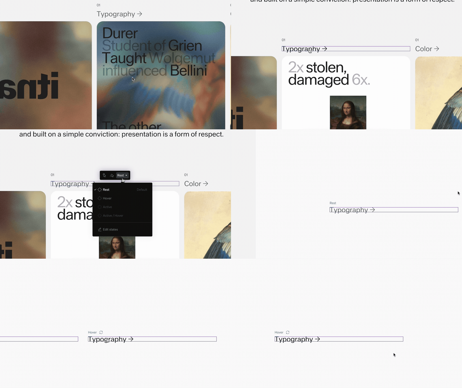
Basics
- States are mutually exclusive: an element is in one state at a time
- Editing a state changes how the element looks in that condition everywhere it appears
- States can be synced (share styling) or overridden individually
Elements with states
Common elements that have states include:- Button: Rest, Hover, Active, Active / Hover
- Toggle button: Rest, Hover, Active, Active / Hover
- Dropdown: Closed, Open
- Menu: Closed, Open
- Menu controls: Rest, Hover
- Search: Rest, Searching
- Search input: Rest, Hover, Loading, Focused, Focused / Hover
- Search result: Rest, Hover
- Input text: Rest, Hover, Focused, Focused / Hover
- Thumbnail: one state per result category, called formats rather than states
Switching states
1
Select an element with states
Select an element such as a button, dropdown, or search.
2
Choose the state
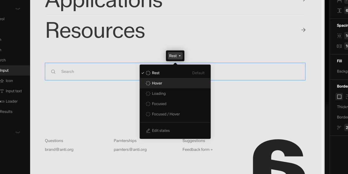
In the contextual toolbar, select the state dropdown, then select available states. States that aren’t currently available are greyed out, with a tooltip explaining why. Alternatively, select the state dropdown from the right settings bar.
3
Choose a state
Select a state to switch the element into it on the canvas. Paired elements stay in sync, so switching a control to Open also opens its menu or dropdown.
Note: If an element has fewer than two available states, no state switcher is shown.
The state editor
The state editor opens an overlay that shows every state of an element side by side, so you can style and compare them at once.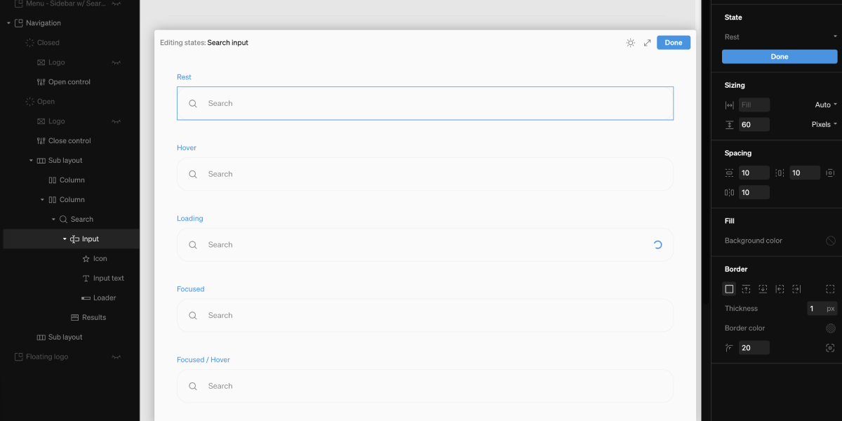
1
Select the element
Select the element you want to edit, such as a button or dropdown.
2
Open the editor
In the right sidebar State settings group (or from the state switcher menu), select Edit states. The overlay opens with a panel for each available state.
3
Style each state
Select elements inside a panel and adjust their settings as normal. Changes apply to that state only. You can multi select to edit multiple at once by holding shift + clicking.
4
Finish
Select Done (or press esc) to close the overlay and return to the canvas.
Editor options
- Move and resize: drag the overlay by its header to reposition it, or drag its edges and corner to resize. The panels reflow to fit the width available.
- Full screen: the expand icon in the header fills the canvas with the editor, which helps when an element has several states. Selecting it again returns to the floating panel.
- Light / dark: the theme icon switches the overlay between light and dark, so you can check a design in both. This affects the overlay only, not the rest of the editor, and it’s remembered per element — an element you’ve switched opens in that mode next time, while elements you haven’t follow the editor’s appearance setting.
Note: States that can’t currently apply, such as a button’s Active with no page link, are left out of the editor entirely. The state switcher still lists them, greyed out with an explanation.
Overrides and resetting
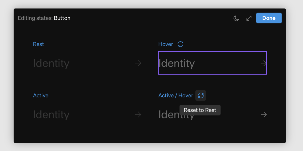
- A blue dot appears next to states that have overrides differing from the default
- To clear a state’s overrides and return it to the default styling, select the blue reset icon in the State settings group title while that state is active
Tip: Style the default state first to get the shared look right, then switch into other states to add only the differences, like a color or scale change on hover.