

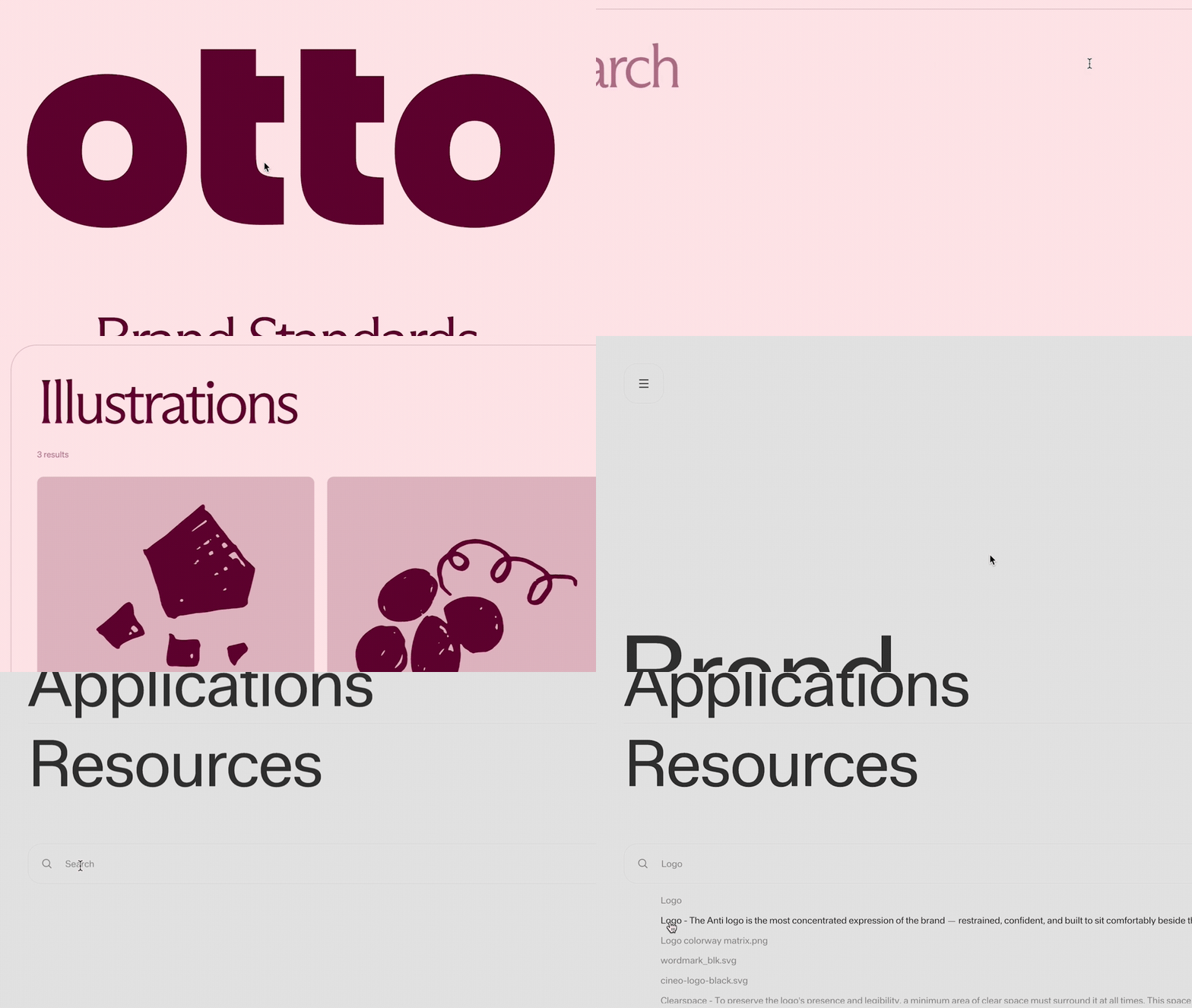
Search indexing
Standards automatically indexes the visible content of your published site:- Pages: page names, plus a summary of the content on the page
- Sections: each section of a page, with its name taken from the heading that leads it
- Files: file names and their descriptions, classified by type (documents, images, fonts, archives, motion, audio)
- Colors: color names and values from swatches
Access control: Content that a viewer can’t access, such as password-protected or sign-in–gated pages, is not surfaced to them in search results. Access is checked at search time, so changing a page’s protection takes effect without republishing.
Adding search
There are two ways to add search to a site: Add a Search menu, or place a search element directly onto a page. Both use the same indexed content.Search menu
A Search menu is a menu that contains a search element and displays results. Add one the same way you add any menu, choosing a search-style starting point.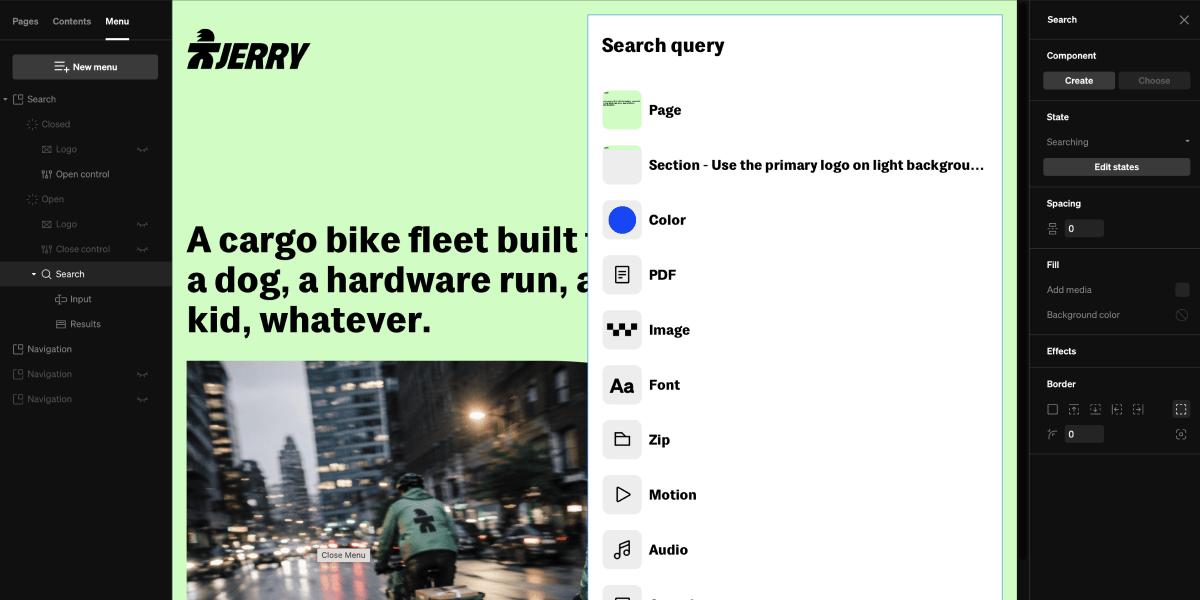
1
Select the Menu tab
Within the editor, select the Menu tab from the left sidebar.
2
Add a new menu
Select New menu. A project can contain multiple menus, so a Search menu can be added alongside an existing navigation menu.
3
Choose Search as the function
In the New menu window, choose Search under Function. (The other functions are Navigation and Custom. See Menus.)
4
Choose a layout and type
Pick where the menu sits and which take on it to use:
- Overlay: Small or Large (a centered panel with a single- or multi-column results layout), or Full screen (a search takeover)
- Sidebar: Open & close or Persistent
- Top bar: Small or Large
5
Choose a style and color, then add
Pick a Style (Default, Rounded, or Translucent) and a Color (Light or Dark), check the live preview, then select Add.
Tip: A common pattern is to add a button anywhere in your project that opens the Search menu with an Open & close click behavior. This lets viewers trigger search from a nav bar, a header, or any element you choose.
Search element
The Search element places a search field and its results directly onto a page, rather than inside a menu. It’s the same search experience, positioned within your page layout.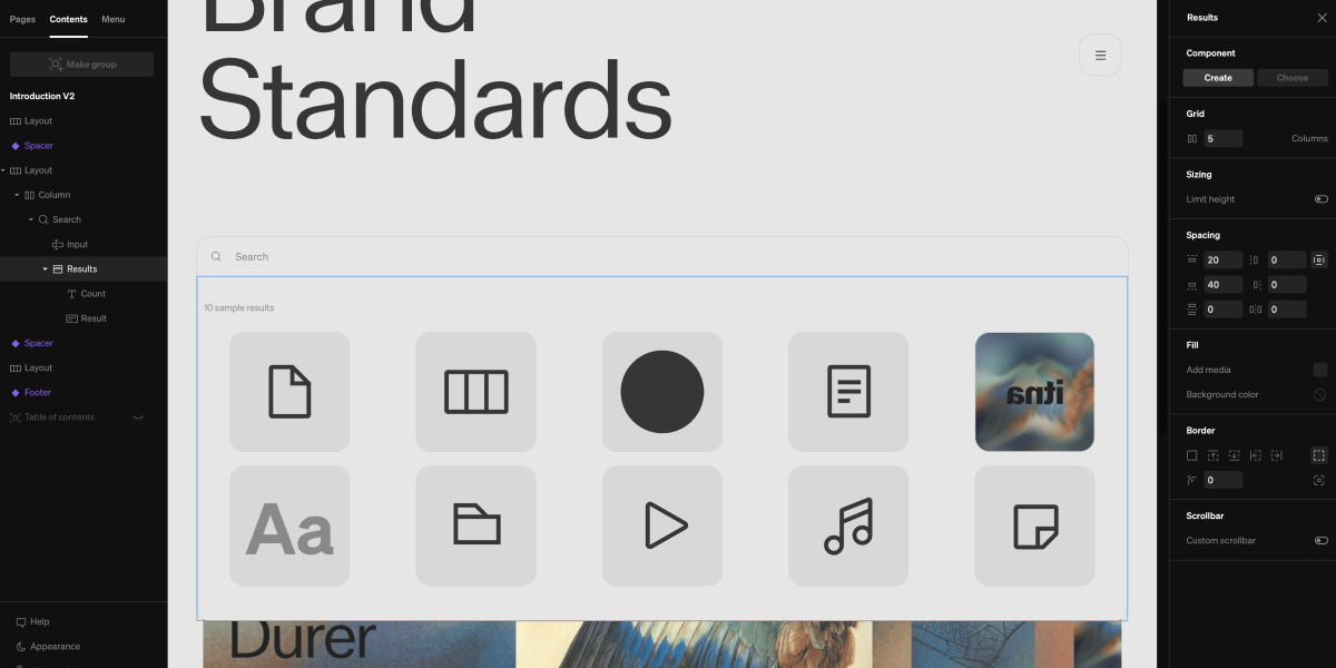
1
Choose the add tool
From within the editor, open the + menu and choose Search.
2
Place it on the page
Select the add point where you want the element to sit within your page layout.
3
Style it
Select the element and its inner parts (Input, Results, result rows) and adjust their settings in the right sidebar as you would any other element.
In the editor: The search field shows example placeholder results so you can design and style it. Real results come from your published content. Try search on the live or preview site to see it working.
Search states
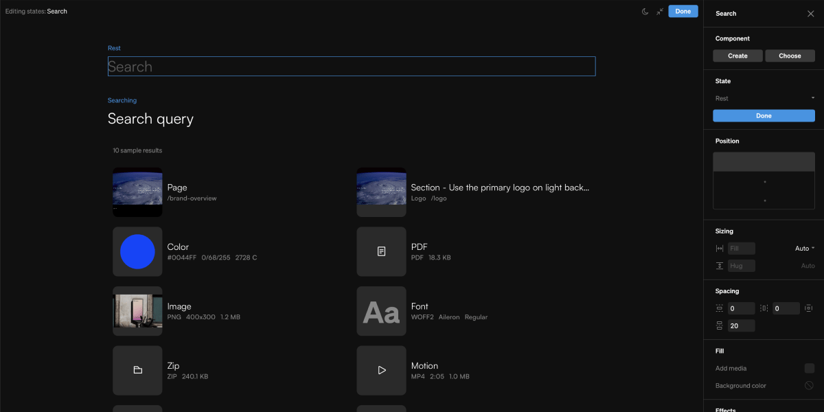
- Search: Rest and Searching (while a search is active)
- Search input: Rest, Hover, Loading, Focused, and Focused / Hover
- Result rows: Rest and Hover
Anatomy
The Search element is made up of a few native parts you can select and style individually:- Input: the field viewers type into
- Results: the area that displays matches, which contains:
- Count: a summary of how many results were found
- Result rows: each with a Thumbnail, a Title, and Details (metadata about the result, such as its page, file type, dimensions, or color values, depending on the kind of result)
Result thumbnails and details
Each result row holds a thumbnail, title, and a details element, and both are configured per result category.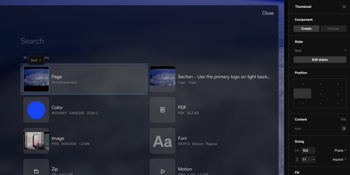
Thumbnail formats
A thumbnail’s appearance is set per category, which the sidebar calls its Format (Page, Section, Document, Image, Font, Archive, Motion, Audio, Color, and File as the catch-all for anything else). Select a thumbnail and use Edit formats to style each one.- Icon: each format has its own default icon glyph, which you can swap. Icon color and Icon scale are under Fill.
- Preview: when on, the thumbnail renders the result’s real content instead of an icon — the color’s swatch, the image file, sample glyphs in the font’s own face, or a scaled live render of the page or section. Each format toggles this independently.
Title fields
A result’s Title can show the entry’s Name, its Description (the indexed body text), or both, toggled per category. A section’s name is its heading, so its description is on by default there to make the result readable; elsewhere the name leads on its own.Details fields
The Details element lists metadata beneath a result’s title, with the available fields depending on the category. Toggle fields on and off per category:- Page: name, URL
- Section: page, section name, URL
- Images: file type, dimensions, file size
- Fonts: file type, family, weight
- Documents and Archives: file type, file size
- Motion and Audio: file type, duration, dimensions, file size
- Colors: HEX, RGB, CMYK, PMS, PMS 2, RAL
Choosing what results appear
The search area’s settings control which content search draws from. Select the Search element and open its Settings from the contextual toolbar.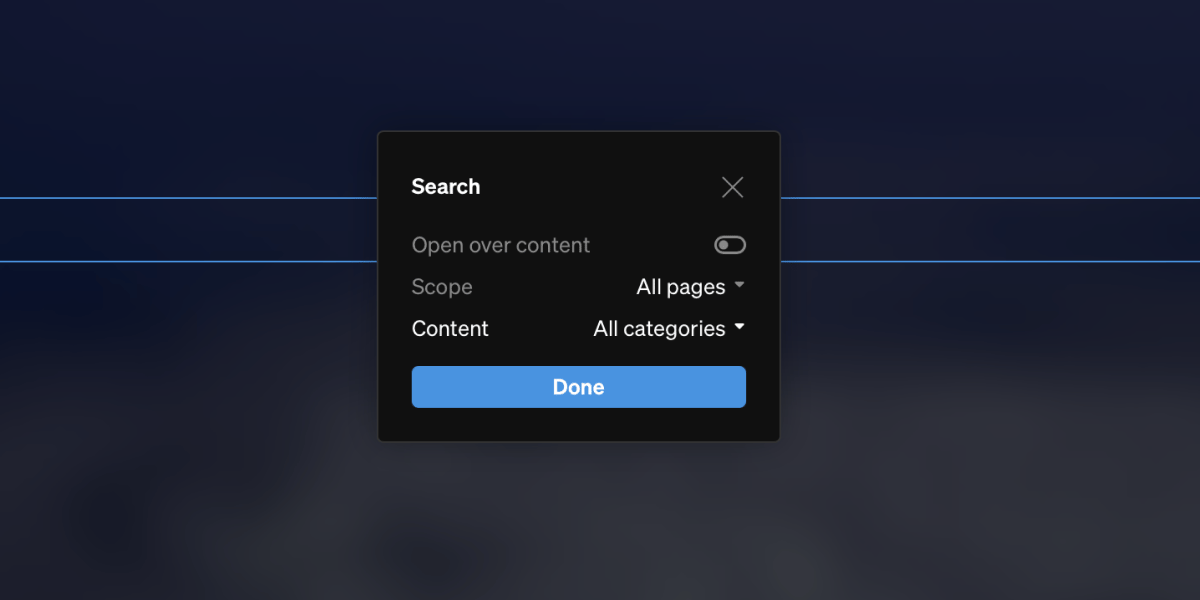
In the editor: The element shows example placeholder results so you can design and style it. Real results come from your published content. Try search on the live or preview site to see it working.
Pages
- All pages: search everything on the site
- This page: only search content on the page the search sits on
- Choose pages: search only the pages you select
Categories
- All categories: return every kind of result
- Choose categories: return only the categories you select — Pages, Sections, Documents, Images, Fonts, and Archives
Tip: Narrowing the categories is a good way to build a purpose-built search, such as a downloads page that only returns files.
Open over content
The search element has the option to either push content below it down when results expand, or open over content so nothing else on the page moves when the results expand. Simple toggle the setting from the settings section of the contextual tools.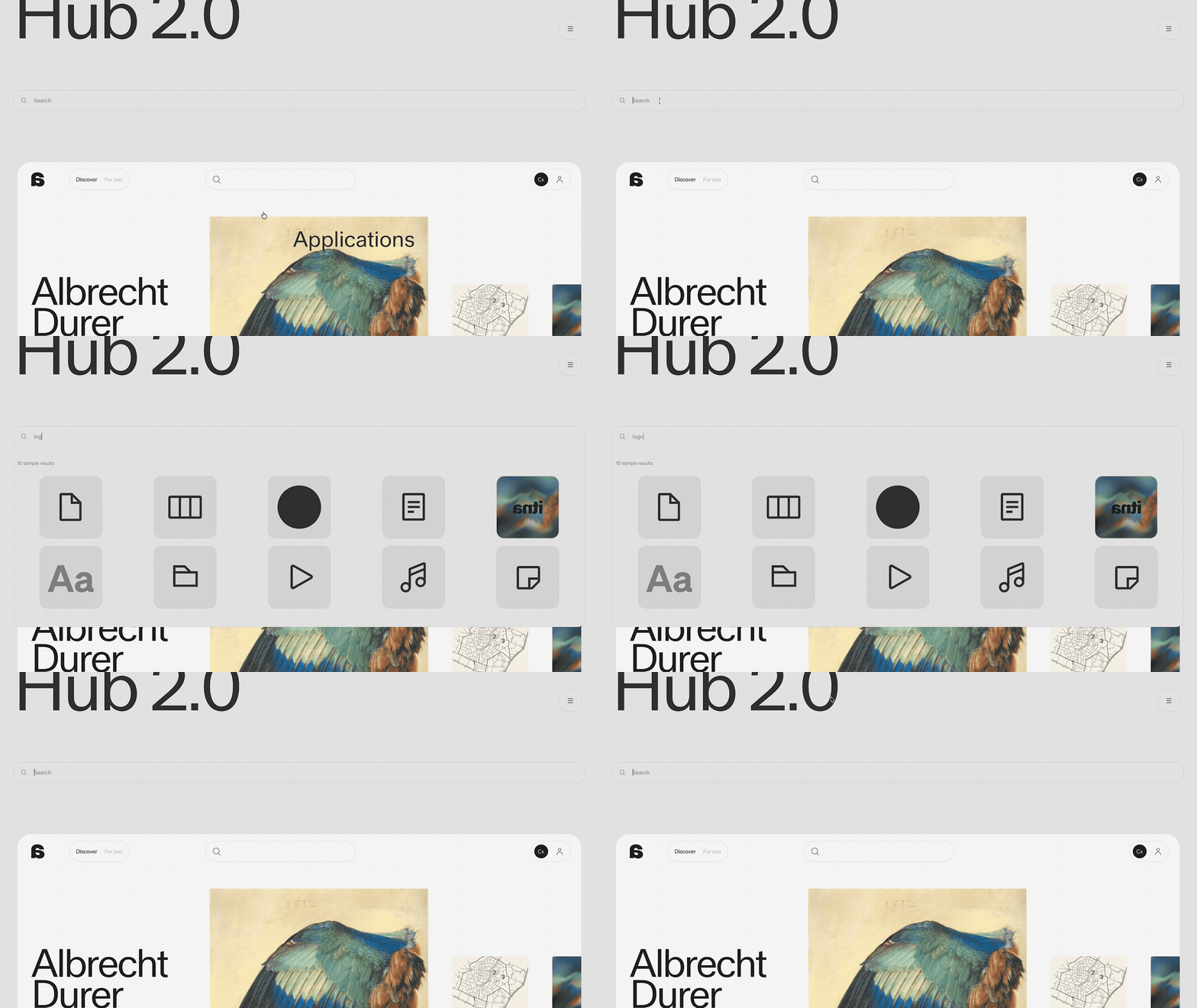
1
Select the search element
From within the body or from the left sidebar, select the search element
2
Select settings
Select the settings button from the contextual tools that show beside the search element in body
3
Toggle open over content
Select the open over content toggle to enable and disable