

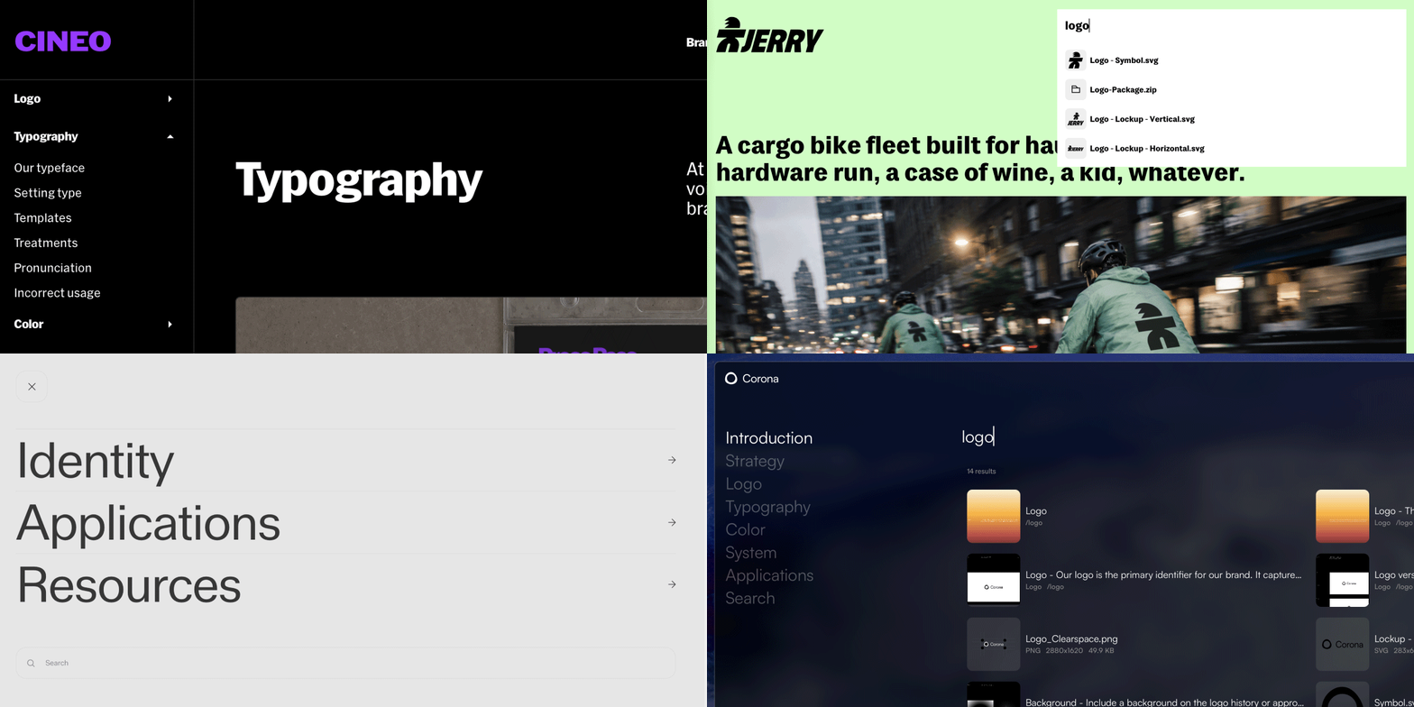
Basics
Menus are elements that can be added to your project, and exist outside the document grid and max width. Menus can hold most content, including media, buttons, dropdowns, and even sublayouts.- Menus are not constrained to mirror the pages of the project
- All menus are the same underlying element and follow the same base settings
- Menus can be styled differently for each breakpoint
- Menus are well suited to contain buttons and dropdowns elements as navigation, but can contain almost any element
- Projects can contain multiple menus
Elements inside menus
- Controls: Visible when a menu has an open & closed state, the controls are buttons that trigger opening and closing the menu. The open control and the close control are two separate elements.
- Logo: A special media layer with absolute positioning. The closed state and the open state each have their own logo element, so they can hold different files at different sizes.
- Content: Any content element (listed in the + menu) can be placed inside the menu in it’s open state.
Adding a menu
1
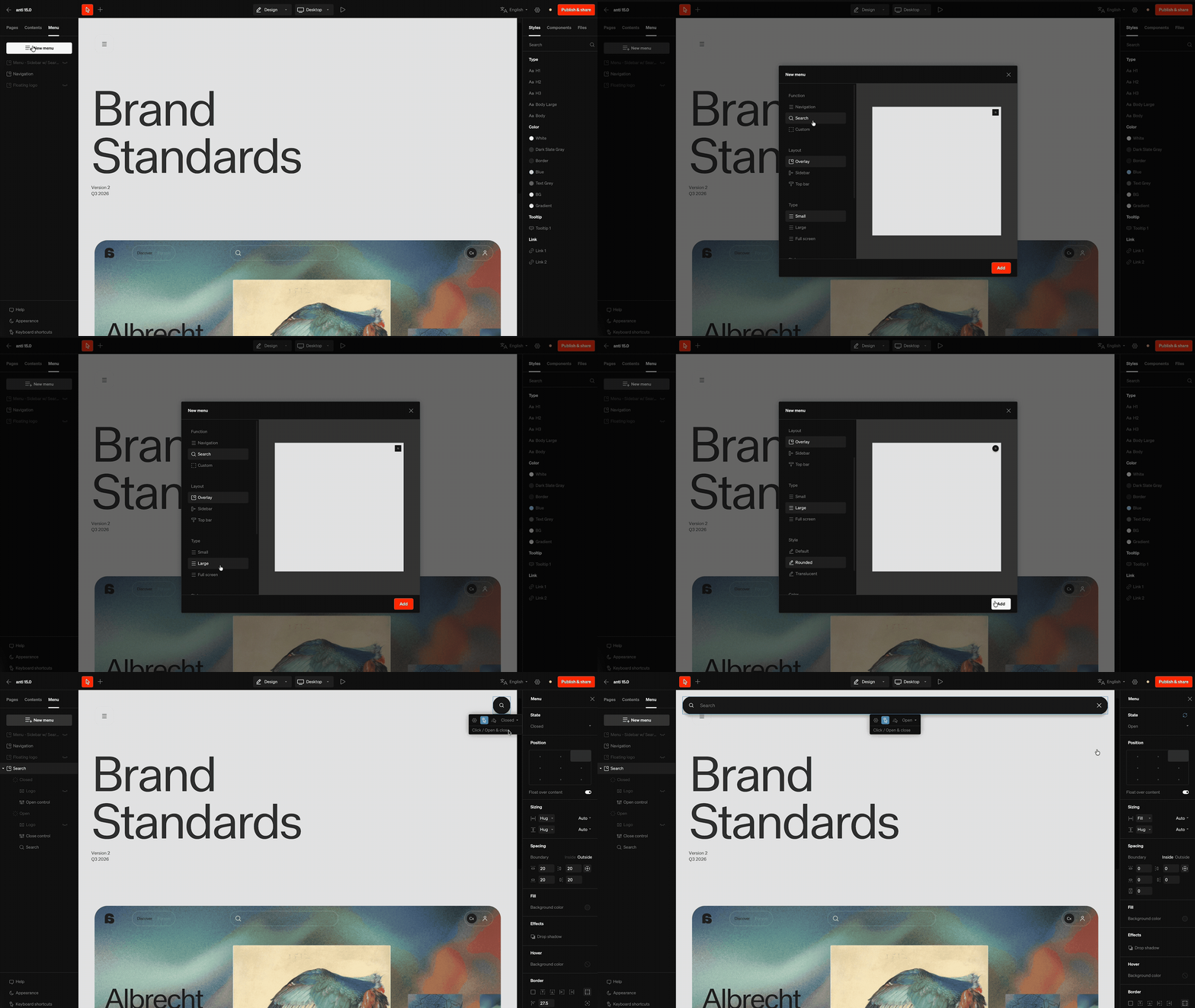
Select menu tab
Within the editor, select the Menu tab from the left sidebar
2
Build the menu from the options
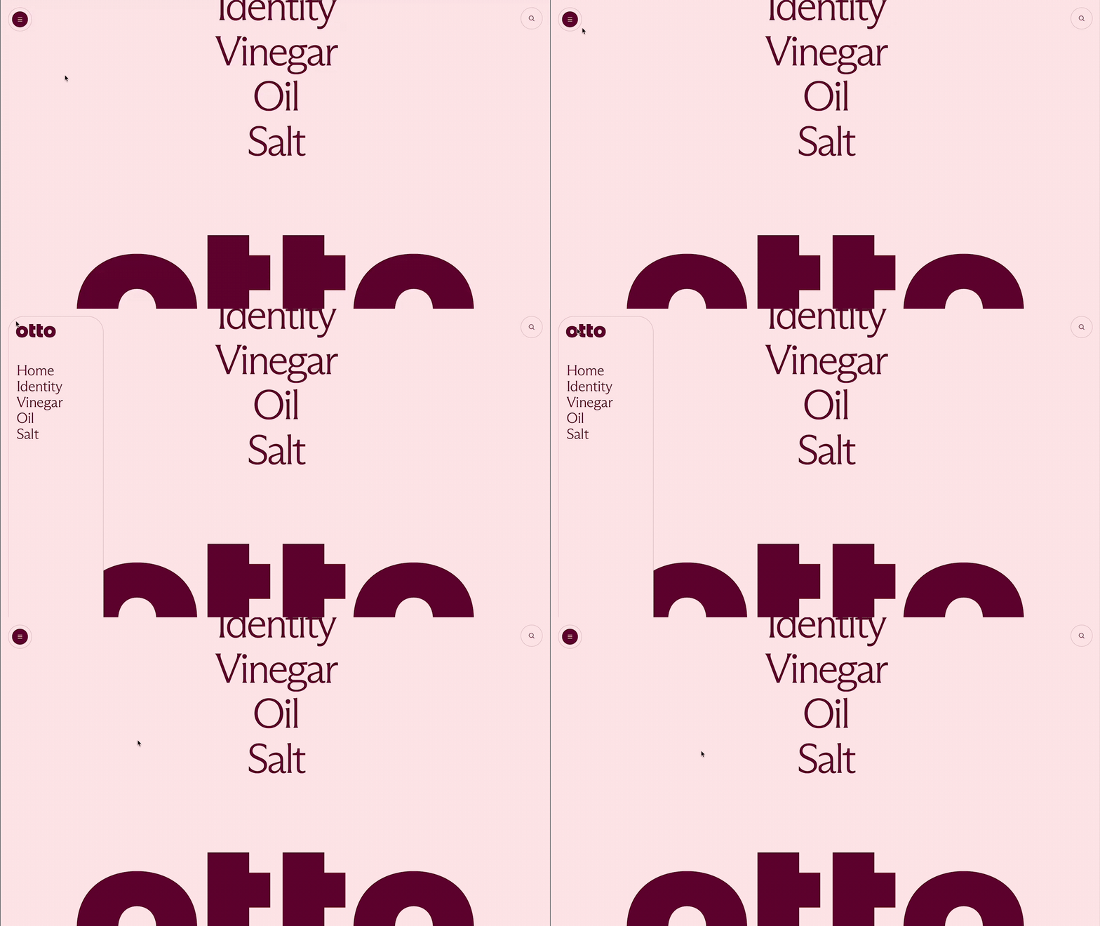
The New menu window has the selections down the left and a live preview of the result on the right. Choose a Function, Layout, Type, Style, and Color (each covered below), then select Add. Menus are fundamentally the same, but these options give a starting point.
Keep in mind: A project can contain multiple menus. Menus stack in layer order, so a menu lower in the layer list appears above the ones before it.
Configuration groupings
Function
Function
What the menu is for. This determines the content the menu starts with.
- Navigation: a persistent global navigation, such as a sidebar or top bar. This is the primary way viewers move around your guideline, and it starts pre-filled with links to the pages in your project.
- Search: a search menu built around a search input and results.
- Custom: the menu chrome only (its logos and controls, positioned for the layout you choose) with nothing inside it. The starting point for a menu you build by hand.
Layout
Layout
Where the menu sits.
- Overlay: floats over your content and opens from a control
- Sidebar: a vertical rail down the side of the page
- Top bar: a horizontal bar across the top of the page
Type
Type
Which of that layout’s takes on the function to use. The available types depend on the Function and Layout you picked.
- Small / Large / Full screen: how much of the viewport the menu takes when open
- Open & close: the menu opens and closes from its control
- Persistent: the menu stays open, with no closed state
- Persistent with groups: stays open, and organizes its links into collapsible groups (built from your project’s page structure)
Style
Style
The shape and surface treatment of the menu. Colors are handled separately by the Color selection.
- Default: square corners and plain fills
- Rounded: rounded corners on the menu, its rows, and its groups
- Translucent: rounded, with a glass treatment — a thinned fill over a backdrop blur
Color
Color
- Light and Dark pre-configure the menu, text, and icon fills.
Keep in mind: Because all menus share the same element and settings, any starting point can be reshaped into another. A flyout can become a sidebar by editing its sizing and Always open settings, and the Style and Color selections are just settings applied on top, so every one of them can be edited afterwards.
On mobile
Every menu becomes an overlay on a phone. A rail or a bar has nowhere to dock at mobile width, so each one floats over the content from the top right, opens on a tap rather than staying open, and opens to the full width of the viewport. This is applied to every starting point as a mobile breakpoint override, so you can adjust or remove it like any other responsive optimization.Native elements
All menus contain two native elements, a controls element for opening/closing and a logo element which can be absolutely positioned.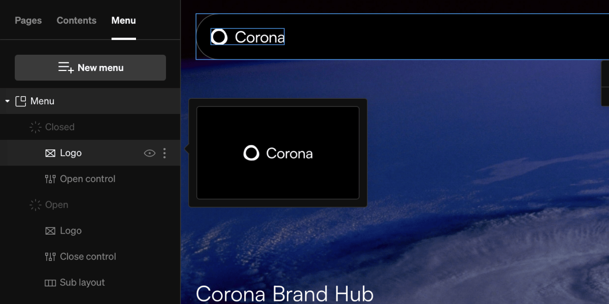
Logo
This element is intended for the brand’s logo. The closed and open states each have their own logo element, so each state’s logo is edited directly and the two can differ. On Custom menus both logos start hidden and can be shown with the layer visibility toggle. Navigation menus link their logo to the home page by default.Controls
These content elements control opening and closing the menu. The open control and the close control are separate elements, each rendering only in its own state, so they can be styled and positioned independently.Adding content to menus
Almost all elements in Standards may be added to a menu. Anything you can add to a column can be added to a menu. Keep in mind: The contents of menus is flexbile and can be configured to best fit your guideline and each breakpoint.
1
Choose add tool
From within the editor, select elements like media M, text T, and button B from the + menu. Some components C may also be chosen to add into menus.
2
Select menu
Hover over the open menu, and select the add point overlay.
3
Reorder and style
Menu content can be reordered by click + dragging from the menu layers in the left sidebar. Each item can be styled by selecting them and modifying their settings in the right sidebar as normal.
4
Set links
Link buttons to pages, URL’s, and more by selecting them, choose click from the contextual toolbar, then adding a click behavior.
Keep in mind: Layouts, groups, and by extension automations or any components of layouts and groups cannot be added inside a menu.
Menu behaviors & settings
The foundation of how menus behave is set through a combination of click, hover, and settings preferences. For example, a flyout menu will often have a click behavior set to ‘open / close’ while a sidebar menu will have the ‘always open’ setting turned on.Keep in mind: The following behaviors and settings are all set through the contextual toolbar that shows when the menu is selected
Always open

Auto hide on scroll

Open & close on click
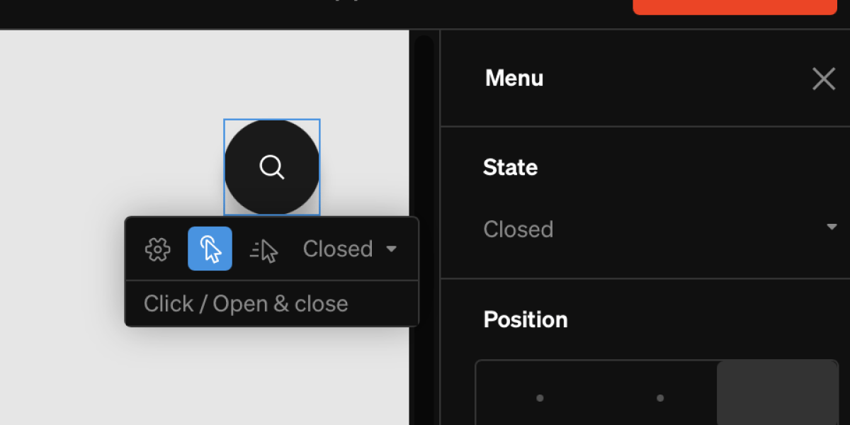
Open & close on hover
Open from another element
Beyond the menu’s own controls, any element can open or close a menu, letting you trigger it from a button, a piece of text, or anywhere else on the page.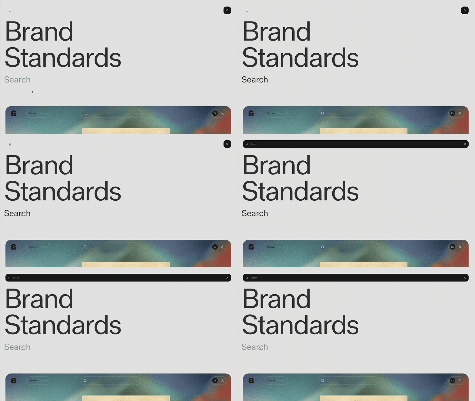
1
Select the element
Choose the element you want to act as the trigger, such as a button.
2
Add an Open & close click behavior
With the element selected, open the click behavior menu from the contextual toolbar and choose Open & close.
3
Choose the menu to control
In the Opens & closes dropdown, select the menu the element should toggle. If the element sits inside a menu or dropdown, it defaults to This menu / This dropdown; otherwise, choose any openable menu in the project by name.
Note: Always-open menus have no closed state, so they aren’t available as a target.
Showing a menu on select pages
By default a menu shows on every page. Each menu chooses which pages it appears on from its own settings, so a project can pair a global navigation with a menu that only appears on a few pages.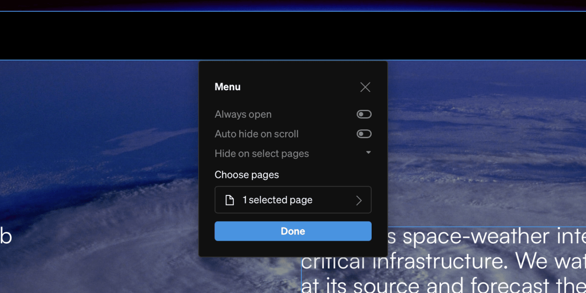
1
Select the menu
Select the menu element, from the canvas or the Menu tab in the left sidebar.
2
Open its settings
From the contextual toolbar, open the menu’s Settings.
3
Choose a visibility mode
Choose Show on all pages, Show on select pages, or Hide on select pages, then pick the pages for the latter two.
In the editor: A menu hidden on the page you’re viewing still renders, dimmed, so it stays selectable and its contents stay reachable. Dimmed menus don’t open on click or hover — only selecting them opens them. Preview mode and the published site honor the setting properly, so check your work in Preview.
Note: Page visibility is set per breakpoint, so a menu can appear on every page at desktop and only a few on mobile.
Float over content
In the Position settings group, the Float over content toggle chooses how the menu relates to the page. This setting is critical to the overall placement of the menu on or beside the site content.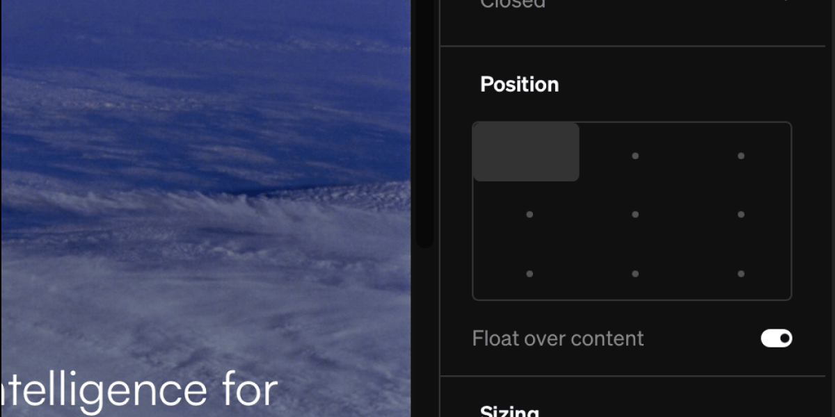
- On: the menu floats over your content and doesn’t affect the page layout. Its position is set per state, so a menu can sit in a corner while closed and open centered.
- Off: the menu docks inside the layout and the page content sits alongside it. A docked menu holds a single dock edge across its states.
Custom scrollbar
A menu taller than the space it has scrolls, and its scrollbar can be styled to match the design rather than left to the browser. Turn on Custom scrollbar in the Scrollbar settings group, then set:- Track color and Track width
- Thumb color, Thumb width, and Thumb radius
Tip: A search menu’s Results area has the same Scrollbar settings, for long result lists.