Basics
- Tooltips are activated through the on hover behavior contextual toolbar
- Tooltip appearance is managed through the Styles tab in the right sidebar
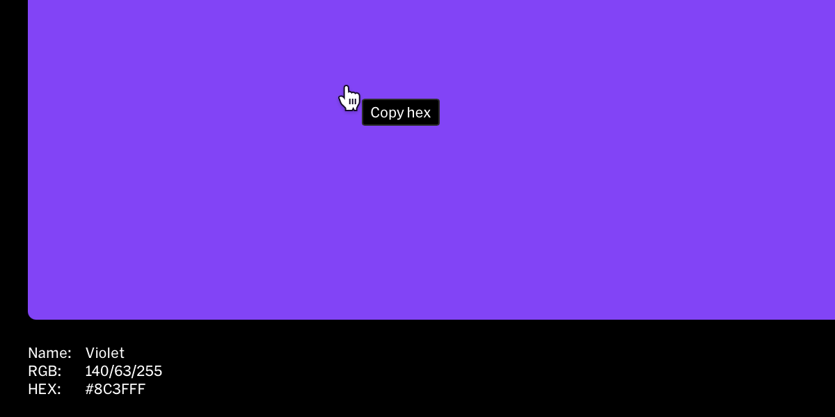
- Tooltip behaviors are contextual to what they are applied to, for example a color swatch tooltip when enabled will automatically say ‘Copy HEX’ and ‘HEX copied’.
Adding a tooltip to an element
1
Select element to add tooltip to
Within the editor from the contents list in the left sidebar or from in-body, select the desired element to apply the tooltip to.
2
Select hover
From the contextual toolbar, select the hover button (hovering cursor icon) to open the hover behavior menu.
3
Choose show tooltip
Input text to override the default or leave it as is, and select the tooltip style it will use, then select
done.Tooltip styles
Edit tooltip style
Tooltips use the style system where their appearance can be edited in one place and automatically update wherever the style is used.1
Select the tooltip style
Within the design editor, select the tooltip style from the Styles tab in the right sidebar
2
Modify settings
Update settings like color, type, spacing to change the look of the tooltip
Add tooltip style
Tooltip styles can be added two ways:- Select the
+button beside the Tooltip title in the styles list. - Select Add new from the style selection dropdown within the hover contextual toolbar