> ## Documentation Index
> Fetch the complete documentation index at: https://help.standards.site/llms.txt
> Use this file to discover all available pages before exploring further.
# Responsive Optimizations
Optimize your brand standards for viewers on tablet and mobile devices.
 ***
## Overview
Mobile optimization is the process of altering settings to enhance a site for viewers on smaller-than-desktop screens. Often optimizations are required for mobile devices, and are encouraged for tablets. All Standards projects start with a desktop breakpoint by default. Tablet and mobile breakpoints can be added which will display optimized settings at those sizes.
### Fundamentals
* All visual assets and written content match between breakpoints by default
* Settings can differ between breakpoints, such as text size and media aspect ratio
* **Columns** wrap within **layouts**, for instance content in a **layout** on desktop with **columns** displaying horizontally can display vertically at the other breakpoints
### Breakpoints
* **Desktop:** Default breakpoint, optimized for larger monitors and laptops over 1020 pixels wide.
* **Tablet:** Optimized for screen widths 1020px to 600px.
* **Mobile:** Optimized for screen widths 600px and under.
**Tip:** Breakpoints can be deactivated/activated from the breakpoint dropdown in the editor top bar
***
## Adding a breakpoint
There are two primary ways to add breakpoints to your Standards projects.
***
## Overview
Mobile optimization is the process of altering settings to enhance a site for viewers on smaller-than-desktop screens. Often optimizations are required for mobile devices, and are encouraged for tablets. All Standards projects start with a desktop breakpoint by default. Tablet and mobile breakpoints can be added which will display optimized settings at those sizes.
### Fundamentals
* All visual assets and written content match between breakpoints by default
* Settings can differ between breakpoints, such as text size and media aspect ratio
* **Columns** wrap within **layouts**, for instance content in a **layout** on desktop with **columns** displaying horizontally can display vertically at the other breakpoints
### Breakpoints
* **Desktop:** Default breakpoint, optimized for larger monitors and laptops over 1020 pixels wide.
* **Tablet:** Optimized for screen widths 1020px to 600px.
* **Mobile:** Optimized for screen widths 600px and under.
**Tip:** Breakpoints can be deactivated/activated from the breakpoint dropdown in the editor top bar
***
## Adding a breakpoint
There are two primary ways to add breakpoints to your Standards projects.
 ### Top bar
Within the project editor, select the breakpoint dropdown from the top bar
From the dropdown, select the `+` button beside the new breakpoint you would like to add
Once added, toggle between the breakpoints by selecting them from the top bar, or by pressing **R**
### Top bar
Within the project editor, select the breakpoint dropdown from the top bar
From the dropdown, select the `+` button beside the new breakpoint you would like to add
Once added, toggle between the breakpoints by selecting them from the top bar, or by pressing **R**
 ### Setup
When starting a new project, select the breakpoints you would like to include from setup. They will automatically be added to your project
Once added, toggle between the breakpoints by selecting them from the top bar, or by pressing **R**
***
## Editing a breakpoint
Editing individual breakpoints is as simple as selecting the breakpoint from the breakpoint dropdown in the top bar or by pressing the R keyboard hotkey. Then select elements to modify and edit their settings.
### Setup
When starting a new project, select the breakpoints you would like to include from setup. They will automatically be added to your project
Once added, toggle between the breakpoints by selecting them from the top bar, or by pressing **R**
***
## Editing a breakpoint
Editing individual breakpoints is as simple as selecting the breakpoint from the breakpoint dropdown in the top bar or by pressing the R keyboard hotkey. Then select elements to modify and edit their settings.
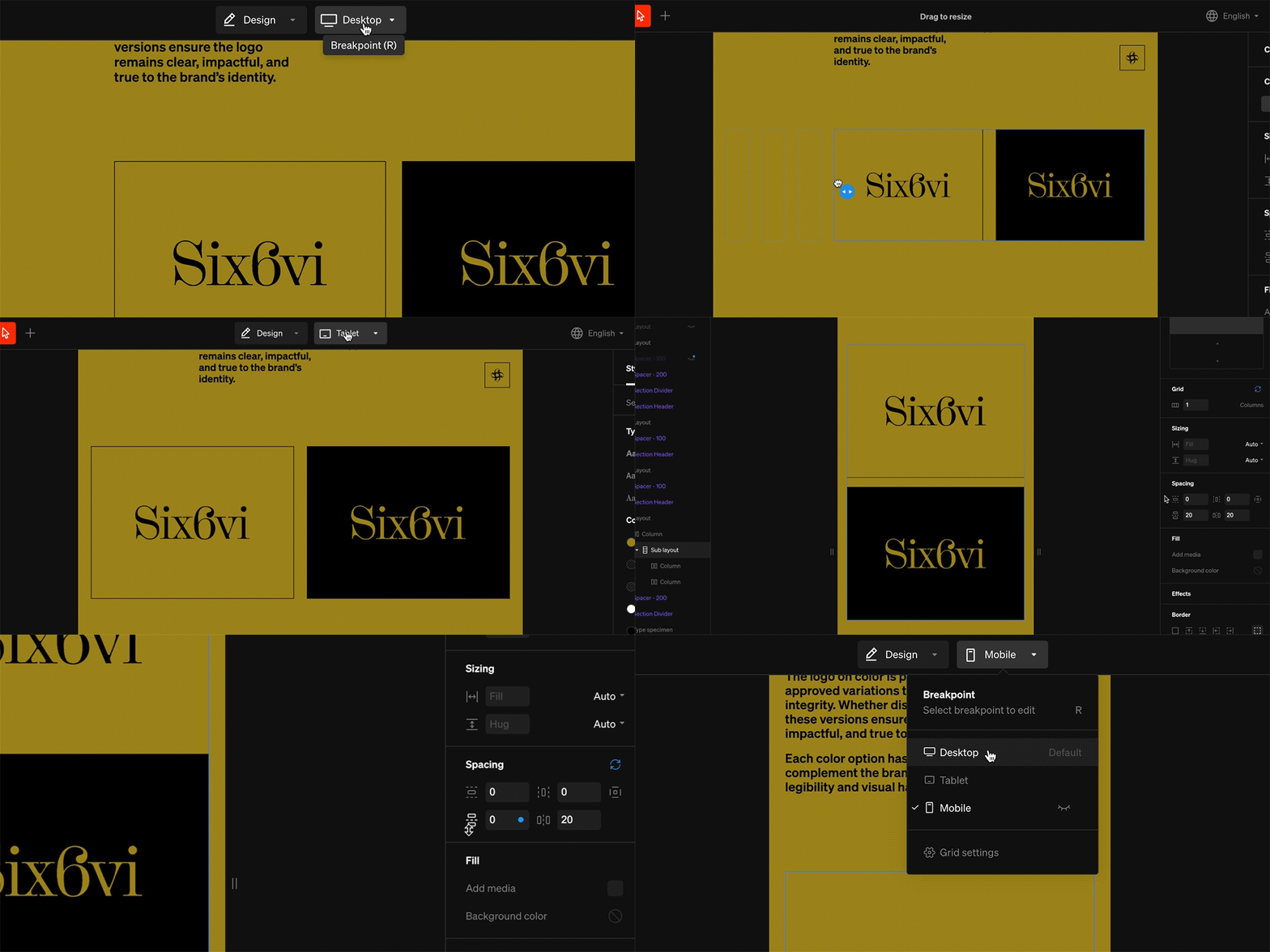 Most settings in tablet and mobile breakpoinidts can be modified to differ from desktop. Settings that differ will display a blue dot beside them for easy recognition. These can be reset by selecting the blue rotating arrows icon that appears beside the settings group title.
***
## Common optimizations
### Menu
Most settings in tablet and mobile breakpoinidts can be modified to differ from desktop. Settings that differ will display a blue dot beside them for easy recognition. These can be reset by selecting the blue rotating arrows icon that appears beside the settings group title.
***
## Common optimizations
### Menu
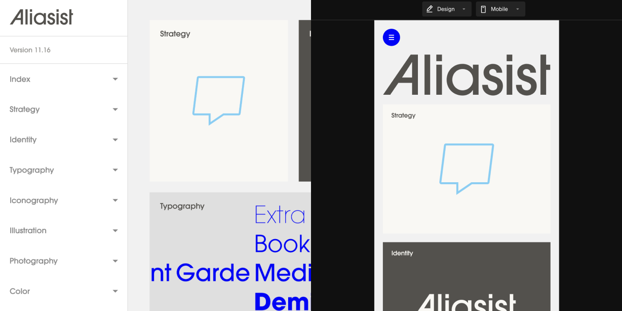 One of the most common changes from desktop that make mobile sites optimized is to the **menu**. **Menus** can be optimized for each breakpoint. Often the mobile **menu** is more of a takeover style while desktop may have a smaller flyout or sidebar.
### Layout grids
One of the most common changes from desktop that make mobile sites optimized is to the **menu**. **Menus** can be optimized for each breakpoint. Often the mobile **menu** is more of a takeover style while desktop may have a smaller flyout or sidebar.
### Layout grids
 Changing a **layout’s grid** is the number one most impactful responsive optimization that can be made. The most common desktop grid is 12 **column**, and the most common mobile grid is 1 **column**, with tablet being somewhere in-between. When adding the mobile breakpoint, **layouts** will be set to 1 **column** automatically, which can be overridden afterwards.
### Text size
Changing a **layout’s grid** is the number one most impactful responsive optimization that can be made. The most common desktop grid is 12 **column**, and the most common mobile grid is 1 **column**, with tablet being somewhere in-between. When adding the mobile breakpoint, **layouts** will be set to 1 **column** automatically, which can be overridden afterwards.
### Text size
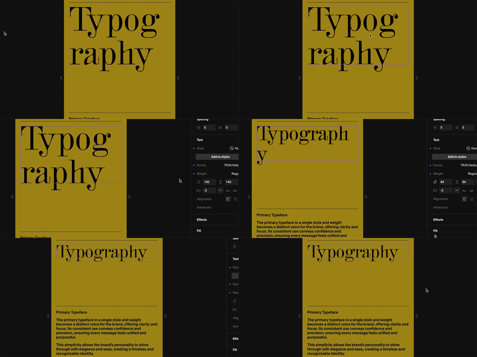 Changing the **text** size as devices reduce in size is an essential responsive optimization. Select any text element, then modify the size from the text settings group. Often the larger sizes on desktop will require a smaller size on mobile.
**Tip:** Creating mobile-specific text styles is a quick and efficient way to swap text size.
### Media
Changing the **text** size as devices reduce in size is an essential responsive optimization. Select any text element, then modify the size from the text settings group. Often the larger sizes on desktop will require a smaller size on mobile.
**Tip:** Creating mobile-specific text styles is a quick and efficient way to swap text size.
### Media
 Often times optimizing imagery aspect ratios for anticipated devices is a great way to retain visual legibility and impact. For instance, a wide landscape meant for viewing on desktop monitors may be best as a tall portrait for view on mobile phones.
***
## Content visibility
Although most settings are distinct to each breakpoint, the page contents are identical across all breakpoints enabling you to select which layers are shown or hidden. This allows you to easily control your design across different window sizes and decide what content is accessible.
Often times optimizing imagery aspect ratios for anticipated devices is a great way to retain visual legibility and impact. For instance, a wide landscape meant for viewing on desktop monitors may be best as a tall portrait for view on mobile phones.
***
## Content visibility
Although most settings are distinct to each breakpoint, the page contents are identical across all breakpoints enabling you to select which layers are shown or hidden. This allows you to easily control your design across different window sizes and decide what content is accessible.
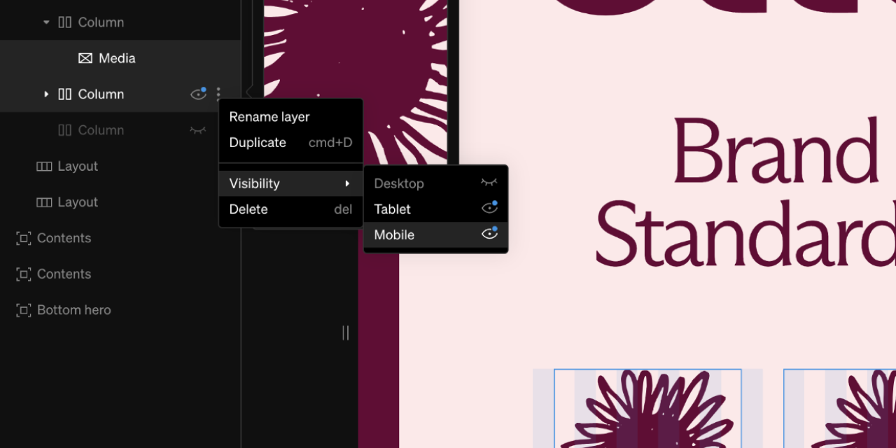 While viewing any breakpoint, from the left sidebar select the 3-dot icon beside a layer
Select each breakpoint's visibility icon (eye) to toggle them on and off. This will either show or hide the contents on the given breakpoint
**Tip:** Sometimes a very specific design is ideal for mobile but uneccessary for desktop. In this case you would design it in the desktop breakpoint, optimize on mobile, and toggle the visibility off on desktop.
***
## Breakpoint visibility
Breakpoints can be toggled on and off. This is especially useful when working on a breakpoint but it’s not quite finished. Toggle the visibility off, then publish.
While viewing any breakpoint, from the left sidebar select the 3-dot icon beside a layer
Select each breakpoint's visibility icon (eye) to toggle them on and off. This will either show or hide the contents on the given breakpoint
**Tip:** Sometimes a very specific design is ideal for mobile but uneccessary for desktop. In this case you would design it in the desktop breakpoint, optimize on mobile, and toggle the visibility off on desktop.
***
## Breakpoint visibility
Breakpoints can be toggled on and off. This is especially useful when working on a breakpoint but it’s not quite finished. Toggle the visibility off, then publish.
 Within the editor, from the top bar, select the breakpoint dropdown
Beside each beakpoint is a visbility icon (eye) that can be toggled. Select this icon to toggle the breakpoint on and off.
Publish changes for this change to take effect.
***
## Grid settings
The **Grid** settings control defaults and preferences for the different breakpoints. They allow for site-wide changes to to be applied. These settings are accessed from the breakpoint dropdown in the top bar.
Within the editor, from the top bar, select the breakpoint dropdown
Beside each beakpoint is a visbility icon (eye) that can be toggled. Select this icon to toggle the breakpoint on and off.
Publish changes for this change to take effect.
***
## Grid settings
The **Grid** settings control defaults and preferences for the different breakpoints. They allow for site-wide changes to to be applied. These settings are accessed from the breakpoint dropdown in the top bar.
 ***
## Settings overrides
When working in the **tablet** or **mobile** breakpoint, by default the settings and content will match **desktop**. Most settings can be changed to enhance design at that breakpoint. The changes can be reset back to default at any time.
***
## Settings overrides
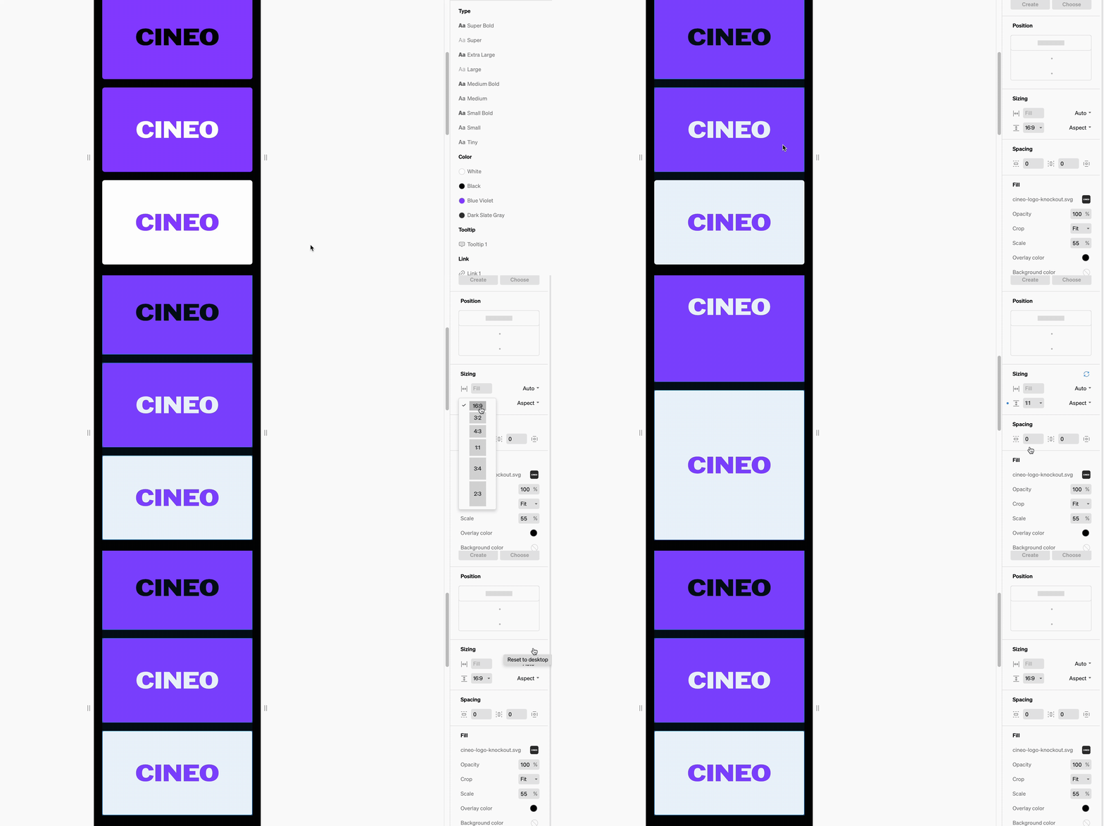
When working in the **tablet** or **mobile** breakpoint, by default the settings and content will match **desktop**. Most settings can be changed to enhance design at that breakpoint. The changes can be reset back to default at any time.
 ### Indicators
Any time a setting is different than default/desktop, there will be a small blue dot beside the setting. Reset back to default by selecting the blue rotating arrow icon beside the settings group title.
***
## Breakpoint preview width
Both tablet and mobile previews can be altered to view at various widths. Within the breakpoint, click + drag left / right on the preview grabbers to increase and decrease the preview.
### Indicators
Any time a setting is different than default/desktop, there will be a small blue dot beside the setting. Reset back to default by selecting the blue rotating arrow icon beside the settings group title.
***
## Breakpoint preview width
Both tablet and mobile previews can be altered to view at various widths. Within the breakpoint, click + drag left / right on the preview grabbers to increase and decrease the preview.
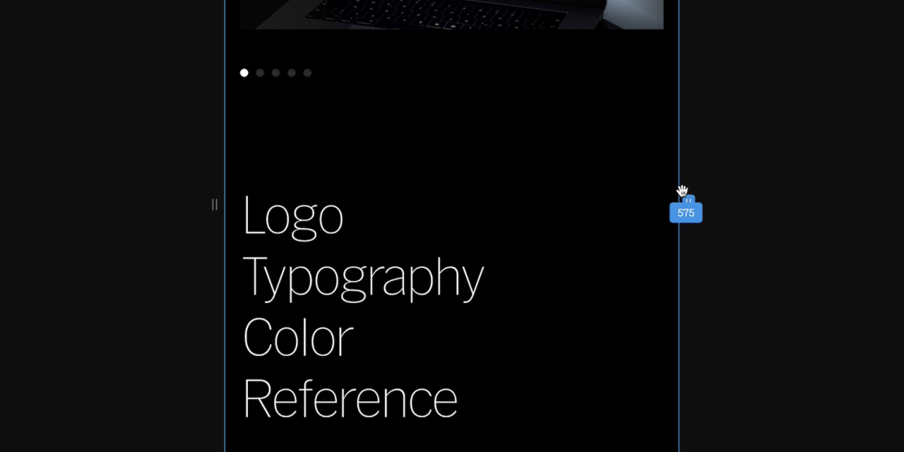 **Keep in mind:** The preview grabbers only control the preview, not the actual width of the breakpoint.Learn more about breakpoints in [Grid](/grid)
***
## Frequently asked questions
Mobile optimization is the process of altering settings to enhance a site for viewers on smaller than desktop computer screens. Often optimizations are required for mobile phone, and are encouraged for tablets / small laptops. Optimizations typically include changes to text size, image aspect ratio, and content grid.
No, you don’t have to, and can toggle your project’s responsive breakpoints on/off.
Breakpoints are the screen width thresholds at which your site changes to accommodate different device sizes. There are three breakpoints in Standards; desktop, mobile and tablet. The default breakpoint for all projects is desktop.
Standards sites are most often referenced by designers and teammates that are accessing the sites from their desktop computers.
**Keep in mind:** The preview grabbers only control the preview, not the actual width of the breakpoint.Learn more about breakpoints in [Grid](/grid)
***
## Frequently asked questions
Mobile optimization is the process of altering settings to enhance a site for viewers on smaller than desktop computer screens. Often optimizations are required for mobile phone, and are encouraged for tablets / small laptops. Optimizations typically include changes to text size, image aspect ratio, and content grid.
No, you don’t have to, and can toggle your project’s responsive breakpoints on/off.
Breakpoints are the screen width thresholds at which your site changes to accommodate different device sizes. There are three breakpoints in Standards; desktop, mobile and tablet. The default breakpoint for all projects is desktop.
Standards sites are most often referenced by designers and teammates that are accessing the sites from their desktop computers.