> ## Documentation Index
> Fetch the complete documentation index at: https://help.standards.site/llms.txt
> Use this file to discover all available pages before exploring further.
# Navigation Menu
Navigation Menus are a persistent element that allows viewers to easily access different sections, pages, languages, or resources within a website.
 ***
## Basics
Menus are elements that can be added to your project, and exist outside the document grid and max width. Menus can hold most content, and can be linked up to pages, downloads, external URLs, and more.
* **Menus** are not constrained to mirror the pages of the project
* All **menus** follow the same base settings
* **Menus** can be styled different for each breakpoint
* **Menus** are well suited for Buttons and Dropdowns as navigation, but can contain almost any element
* Only one **menu** is allowed
### Elements inside menus
* **Controls:** Visible when a menu has an open & closed state, the controls are a button that control triggering the opening and closing of the menu.
* **Logo:** A special media layer with absolute positioning, the logo inside menus can be shown in either open and or closed states, and be filled with different files.
***
## Adding a menu
***
## Basics
Menus are elements that can be added to your project, and exist outside the document grid and max width. Menus can hold most content, and can be linked up to pages, downloads, external URLs, and more.
* **Menus** are not constrained to mirror the pages of the project
* All **menus** follow the same base settings
* **Menus** can be styled different for each breakpoint
* **Menus** are well suited for Buttons and Dropdowns as navigation, but can contain almost any element
* Only one **menu** is allowed
### Elements inside menus
* **Controls:** Visible when a menu has an open & closed state, the controls are a button that control triggering the opening and closing of the menu.
* **Logo:** A special media layer with absolute positioning, the logo inside menus can be shown in either open and or closed states, and be filled with different files.
***
## Adding a menu
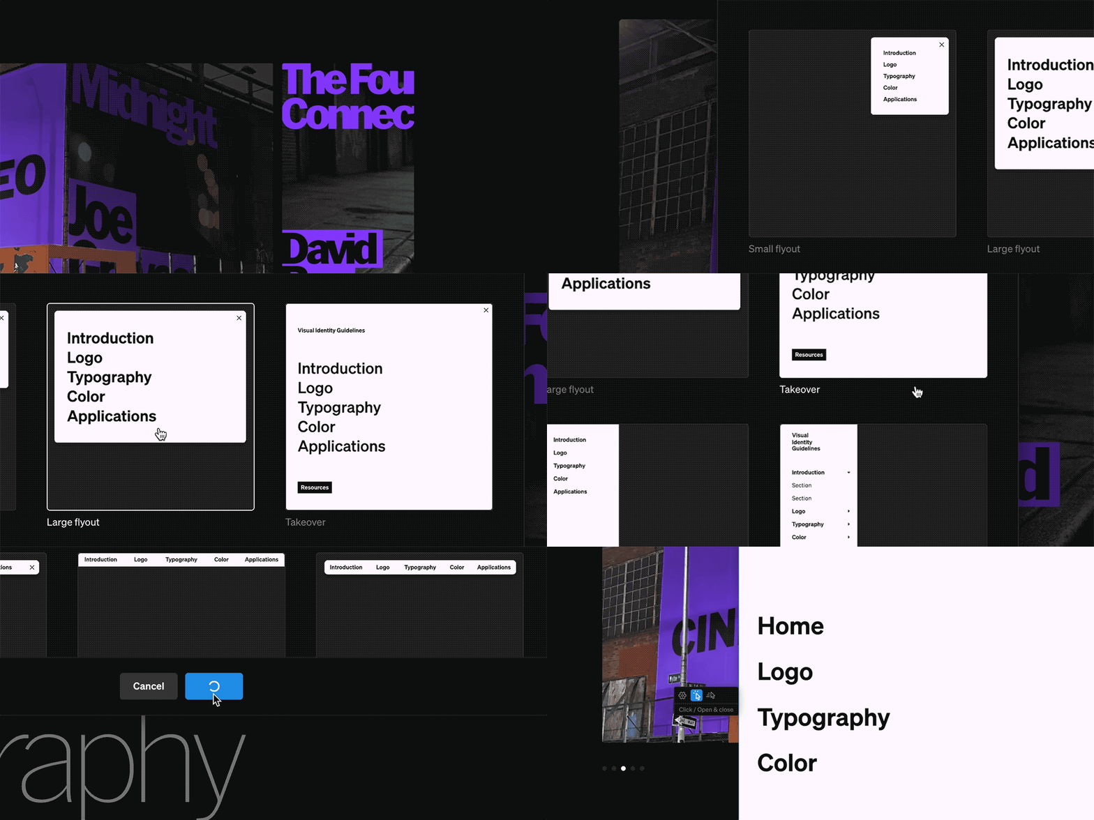 Within the editor, select the **Menu** tab from the left sidebar
Select the **New menu** button. If an existing menu exists, it must be deleted prior to adding a new one
Choose a menu type as a starting place for your new **menu.** Note: All menus shown are the same element, just with different setting applied.
**Keep in mind:** If your project already has a menu, you can delete it to add a new one. Be aware if you delete an existing menu you will need to restyle and link buttons in the new one.
### Menu options
When adding a new **menu**, there are various styling options to start from. Keep in mind that all **menus** can be achieved by simply changing the settings of the **menu** at any point once it’s added. For instance, a flyout menu can be changed to a sidebar by editing the sizing and ‘always open’ settings.
***
## Native elements
Within every menu are two native elements:
1. **Logo**
2. **Controls**
Both of these elements have unique properties, most noticeably that they can be absolutely positioned. They can be shown or hidden using the layer visibility toggle (eye icon) in the left sidebar.
### Logo
This element is intended for the brand’s logo. Both the open and closed state of the menu can have this element, and they can differ from one another.
### Controls
This content element is used to control opening and closing the menu. Both the open and closed state can have this element, and they can differ from one another.
***
## Adding content to menus
Almost all elements in Standards may be added to a **menu**. Anything you can add to a **column** can be added to a **menu. Keep in mind:** The contents of menus is flexbile and can be configured to best fit your guideline and each breakpoint.
Within the editor, select the **Menu** tab from the left sidebar
Select the **New menu** button. If an existing menu exists, it must be deleted prior to adding a new one
Choose a menu type as a starting place for your new **menu.** Note: All menus shown are the same element, just with different setting applied.
**Keep in mind:** If your project already has a menu, you can delete it to add a new one. Be aware if you delete an existing menu you will need to restyle and link buttons in the new one.
### Menu options
When adding a new **menu**, there are various styling options to start from. Keep in mind that all **menus** can be achieved by simply changing the settings of the **menu** at any point once it’s added. For instance, a flyout menu can be changed to a sidebar by editing the sizing and ‘always open’ settings.
***
## Native elements
Within every menu are two native elements:
1. **Logo**
2. **Controls**
Both of these elements have unique properties, most noticeably that they can be absolutely positioned. They can be shown or hidden using the layer visibility toggle (eye icon) in the left sidebar.
### Logo
This element is intended for the brand’s logo. Both the open and closed state of the menu can have this element, and they can differ from one another.
### Controls
This content element is used to control opening and closing the menu. Both the open and closed state can have this element, and they can differ from one another.
***
## Adding content to menus
Almost all elements in Standards may be added to a **menu**. Anything you can add to a **column** can be added to a **menu. Keep in mind:** The contents of menus is flexbile and can be configured to best fit your guideline and each breakpoint.
 From within the editor, select elements like **media** M, **text** T, and **button** B from the + menu. Some **components** C may also be chosen to add into menus.
Hover over the open **menu**, and select the add point overlay.
Menu content can be reordered by click + dragging from the **menu** layers in the left sidebar. Each item can be styled by selecting them and modifying their settings in the right sidebar as normal.
Link buttons to pages, URL’s, and more by selecting them, choose click from the contextual toolbar, then adding a **click** behavior.
**Keep in mind:** **Layouts**, **groups**, and by extension **automations** or any **components** of **layouts** and **groups** cannot be added inside a **menu**.
***
## Interactions
Each **menu** must have some interaction set. Additionally, certain settings may be unique depending on the chosen menu style and interaction type, so it’s worth being intentional about this setting. The available interactions for a Menu are listed below.
From within the editor, select elements like **media** M, **text** T, and **button** B from the + menu. Some **components** C may also be chosen to add into menus.
Hover over the open **menu**, and select the add point overlay.
Menu content can be reordered by click + dragging from the **menu** layers in the left sidebar. Each item can be styled by selecting them and modifying their settings in the right sidebar as normal.
Link buttons to pages, URL’s, and more by selecting them, choose click from the contextual toolbar, then adding a **click** behavior.
**Keep in mind:** **Layouts**, **groups**, and by extension **automations** or any **components** of **layouts** and **groups** cannot be added inside a **menu**.
***
## Interactions
Each **menu** must have some interaction set. Additionally, certain settings may be unique depending on the chosen menu style and interaction type, so it’s worth being intentional about this setting. The available interactions for a Menu are listed below.
 ### Always open
The menu remains open and adjacent or over the page contents, and does not have a Closed state. This is fundamental to side or top bar menus.
### Always open
The menu remains open and adjacent or over the page contents, and does not have a Closed state. This is fundamental to side or top bar menus.
 ### Auto hide on scroll
The menu hides from a chosen direction when scrolling down, then reveals from that direction when scrolling back up.
### Open & close on click
Clicking on the menu icon triggers the menu to open and close.
### Open & close on hover
Hovering on the menu triggers it to open, hovering off the menu triggers it to close.
***
## Settings
While selecting a **Menu** element, the right sidebar will display the available settings for styling the container. Keep in mind: the **menu** is a parent containing everything within. These settings can be overridden in each breakpoint to allow for optimizations. For instance a sidebar style menu on desktop will most likely need a closed state on mobile.
### Menu states
**Menus** have a range of states that can be styled individually, or synced together. Both closed and open have rest and hover states.
### Auto hide on scroll
The menu hides from a chosen direction when scrolling down, then reveals from that direction when scrolling back up.
### Open & close on click
Clicking on the menu icon triggers the menu to open and close.
### Open & close on hover
Hovering on the menu triggers it to open, hovering off the menu triggers it to close.
***
## Settings
While selecting a **Menu** element, the right sidebar will display the available settings for styling the container. Keep in mind: the **menu** is a parent containing everything within. These settings can be overridden in each breakpoint to allow for optimizations. For instance a sidebar style menu on desktop will most likely need a closed state on mobile.
### Menu states
**Menus** have a range of states that can be styled individually, or synced together. Both closed and open have rest and hover states.