> ## Documentation Index
> Fetch the complete documentation index at: https://help.standards.site/llms.txt
> Use this file to discover all available pages before exploring further.
# Layouts
Layouts are the fundamental structures containing a grid which controls the content structure within.
 ***
## Basics
Nearly all content is wrapped in a **layout**. Most commonly, **layouts** are created automatically as elements like **media** and **text** are added. They are the structure around **columns**, inherently span the width of the window, control the grid, have spacing, and margins.
### Fundamentals
* **Layouts** are created when adding other elements.
* **Layouts** encapsulate **columns**.
* **Layout** settings such as grid count can change between breakpoints.
* **Layouts** will wrap if the contents within exceed the grid count.
Note: **Rows** have been replaced with **Layouts.** If you are familiar with rows in pre 12.0 releases, they are the same but with added functionality.
***
## Grid
The grid of a **layout** is what controls the number of **columns** within. When the number of **columns** within a layout exceeds the grid count, it will wrap to the next line. This is foundational to mobile optimization, allowing columns to be side-by-side on desktop but then stack vertically on mobile.
***
## Basics
Nearly all content is wrapped in a **layout**. Most commonly, **layouts** are created automatically as elements like **media** and **text** are added. They are the structure around **columns**, inherently span the width of the window, control the grid, have spacing, and margins.
### Fundamentals
* **Layouts** are created when adding other elements.
* **Layouts** encapsulate **columns**.
* **Layout** settings such as grid count can change between breakpoints.
* **Layouts** will wrap if the contents within exceed the grid count.
Note: **Rows** have been replaced with **Layouts.** If you are familiar with rows in pre 12.0 releases, they are the same but with added functionality.
***
## Grid
The grid of a **layout** is what controls the number of **columns** within. When the number of **columns** within a layout exceeds the grid count, it will wrap to the next line. This is foundational to mobile optimization, allowing columns to be side-by-side on desktop but then stack vertically on mobile.
 ### Pack columns
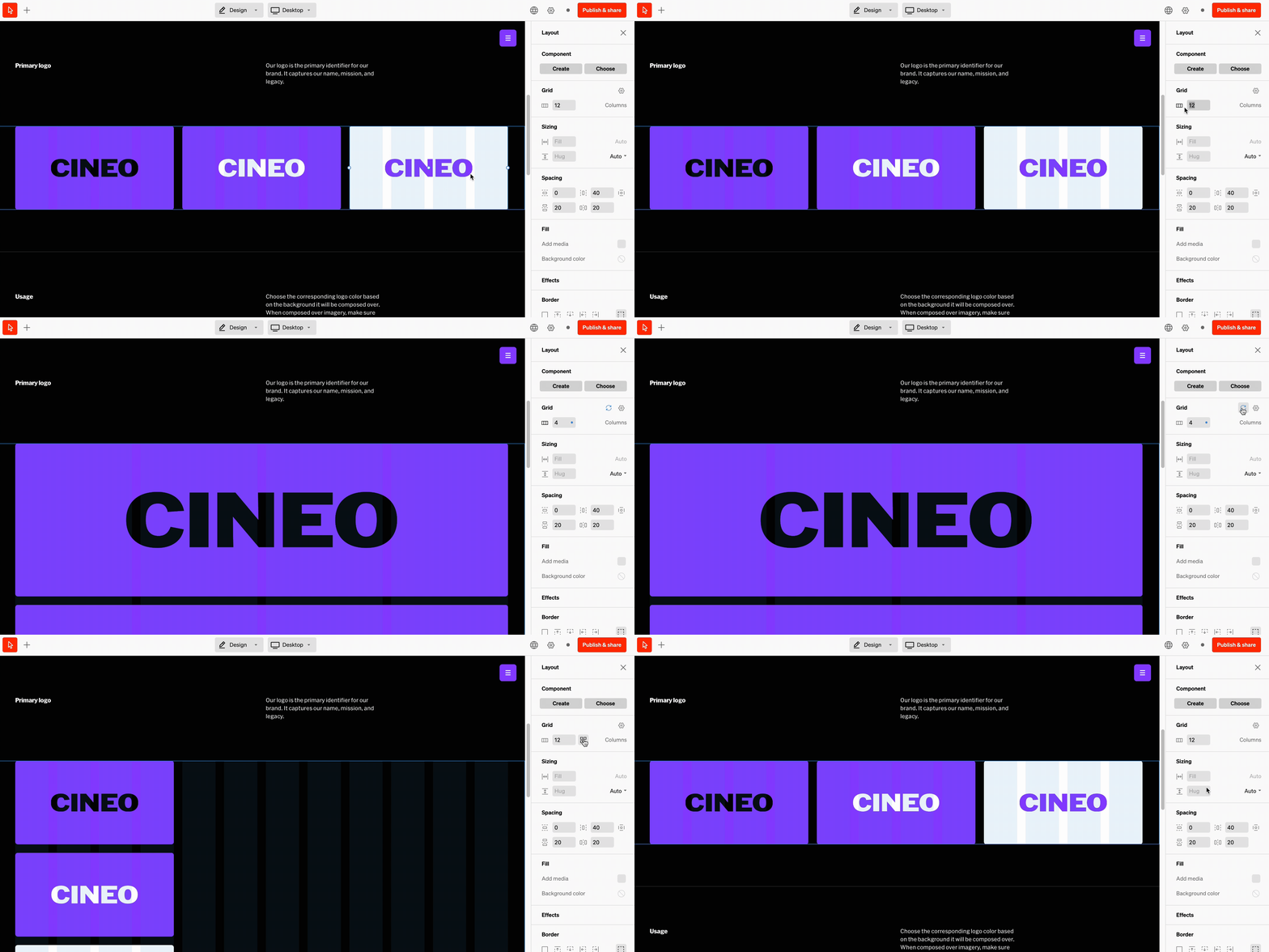
When changing the grid count, **columns** will stay wrapped. They can be repositioned in body, but selecting the ‘Pack columns’ button beside the grid input quickly repositions them.
### Tip
For tile based designs like a grid of images, it’s suggested to use a grid with less **columns** so the content wraps fluidly. Set up this way, you can add, remove, and reposition **columns** quickly.
***
## Default grid settings
While every **layout’s** grid count can be set individually, they are also controlled by a default grid setting. This default is what new **layout** grids will be set to. If this is overridden on a specific layout, it can be reset to the grid default.
### Pack columns
When changing the grid count, **columns** will stay wrapped. They can be repositioned in body, but selecting the ‘Pack columns’ button beside the grid input quickly repositions them.
### Tip
For tile based designs like a grid of images, it’s suggested to use a grid with less **columns** so the content wraps fluidly. Set up this way, you can add, remove, and reposition **columns** quickly.
***
## Default grid settings
While every **layout’s** grid count can be set individually, they are also controlled by a default grid setting. This default is what new **layout** grids will be set to. If this is overridden on a specific layout, it can be reset to the grid default.
 ### How to change default grid settings
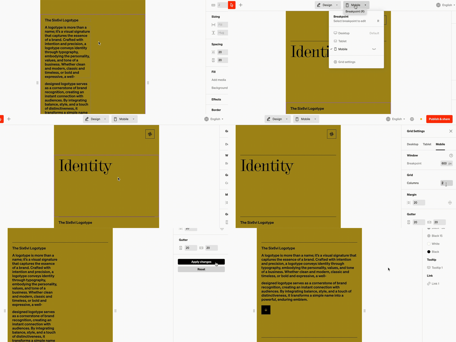
Within the editor select the breakpoint dropdown from the top bar in the center
From the bottom of the breakpoint dropdown, select **Grid settings**
In the right sidebar are settings that will affect an entire breakpoint. Make modifications and save by selecting **Apply changes**.
### Overrides
All **layout’s** grids can be modified to override the default grid. This is helpful when fine-tuning. Overridden **layout** grids can be reset by selecting the rotating arrow icon in the grid settings group.
* Settings in tablet and mobile breakpoints that differ from desktop will show an indicator
* Selecting the rotating arrow icon on a settings group will reset it to match desktop
* Visibility of layers can differ between breakpoints
***
## Columns
**Columns** are the child containing layer within **layouts** which encapsulate the content elements such as media or text.
* Contents within **columns** vertically stack
* If the number of **columns** exceeds the grid count in the **layout** they’re in, they will wrap below.
* **Columns** can be styled with fills, spacing, corner radius, and more
### How to change default grid settings
Within the editor select the breakpoint dropdown from the top bar in the center
From the bottom of the breakpoint dropdown, select **Grid settings**
In the right sidebar are settings that will affect an entire breakpoint. Make modifications and save by selecting **Apply changes**.
### Overrides
All **layout’s** grids can be modified to override the default grid. This is helpful when fine-tuning. Overridden **layout** grids can be reset by selecting the rotating arrow icon in the grid settings group.
* Settings in tablet and mobile breakpoints that differ from desktop will show an indicator
* Selecting the rotating arrow icon on a settings group will reset it to match desktop
* Visibility of layers can differ between breakpoints
***
## Columns
**Columns** are the child containing layer within **layouts** which encapsulate the content elements such as media or text.
* Contents within **columns** vertically stack
* If the number of **columns** exceeds the grid count in the **layout** they’re in, they will wrap below.
* **Columns** can be styled with fills, spacing, corner radius, and more
 ### Wrapping
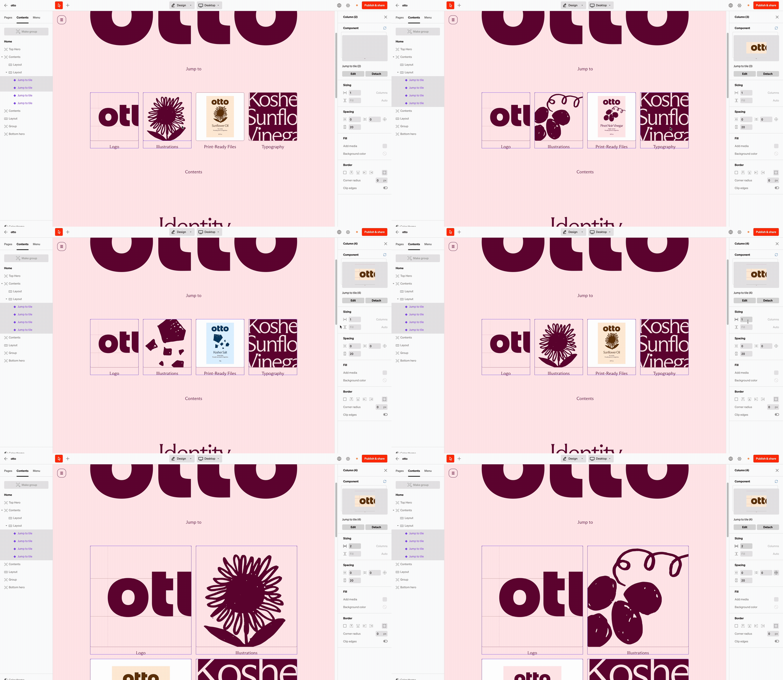
**Columns** are the containing layer within **layouts** that will wrap below onto a new line when the size or number of columns exceeds the grid of the **layout** they’re in\*\*.\*\* This is most evident when viewing on a desktop the **layout** can display columns on a single line, and on mobile they will wrap, stacking vertically.
### Wrapping
**Columns** are the containing layer within **layouts** that will wrap below onto a new line when the size or number of columns exceeds the grid of the **layout** they’re in\*\*.\*\* This is most evident when viewing on a desktop the **layout** can display columns on a single line, and on mobile they will wrap, stacking vertically.
 ### Reordering + Repositioning
**Columns** can be reordered and repositioned in two ways:
1. By select + dragging the middle dot that shows over the column when hovering in-body
2. By select + dragging the **column** layer from the **contents** tab in the left sidebar
***
## Sublayouts
Almost identical to other **layouts**, **sublayouts** are designed to be added into **columns**, **dropdowns** and **menus**, as a powerful structural element. Control the **columns** within the **sublayout** to expand the ways content can be structured.
### Common uses
### Reordering + Repositioning
**Columns** can be reordered and repositioned in two ways:
1. By select + dragging the middle dot that shows over the column when hovering in-body
2. By select + dragging the **column** layer from the **contents** tab in the left sidebar
***
## Sublayouts
Almost identical to other **layouts**, **sublayouts** are designed to be added into **columns**, **dropdowns** and **menus**, as a powerful structural element. Control the **columns** within the **sublayout** to expand the ways content can be structured.
### Common uses
 ### Menu items
To achieve horizontal menus, add **sublayouts** into the **menu**. With a **sublayout** added a customizable grid count can be set, and elements like **buttons** and **media** can be added into them.
### Menu items
To achieve horizontal menus, add **sublayouts** into the **menu**. With a **sublayout** added a customizable grid count can be set, and elements like **buttons** and **media** can be added into them.
 ### Cards
Turn **columns** into dynamic card designs with side-by-side elements by adding **sublayouts** into **columns**.
### Cards
Turn **columns** into dynamic card designs with side-by-side elements by adding **sublayouts** into **columns**.
 ### Bento box
Build a modular visual grid, often used on home pages for navigation.
***
## FAQ
Because ‘rows’ are now more than just a horizontal structure, they needed a more flexible name. This felt especially necessary for mobile since a ‘row’ is often a tall stack of content
Sublayouts allow for content in a column to be laid out horizontally. This is common when you want 2 text boxes side-by-side in a column, or an icon beside text.
### Bento box
Build a modular visual grid, often used on home pages for navigation.
***
## FAQ
Because ‘rows’ are now more than just a horizontal structure, they needed a more flexible name. This felt especially necessary for mobile since a ‘row’ is often a tall stack of content
Sublayouts allow for content in a column to be laid out horizontally. This is common when you want 2 text boxes side-by-side in a column, or an icon beside text.