> ## Documentation Index
> Fetch the complete documentation index at: https://help.standards.site/llms.txt
> Use this file to discover all available pages before exploring further.
# Grid
Grids are structural framework used to organize and lay out content
 ***
## Basics
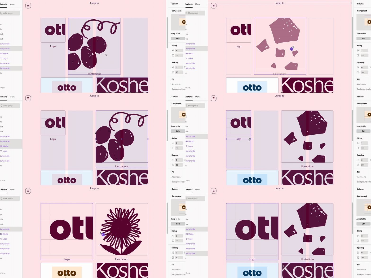
In Standards the grid setting is modified within each **layout** layer. This is set to a default count and can be overridden on each **layout** at each breakpoint. The grid count sets how many columns can fit within before wrapping.
* **Columns** and the content within fit within the grid of the **layout**
* Each breakpoint has a default grid setting that all **layouts** are set to
* Each **layout’s** default grid count can be set to whatever you like
* If the quantity or width of **columns** within a **layout** exceed the grid count they will wrap below.
### How to change default grid settings
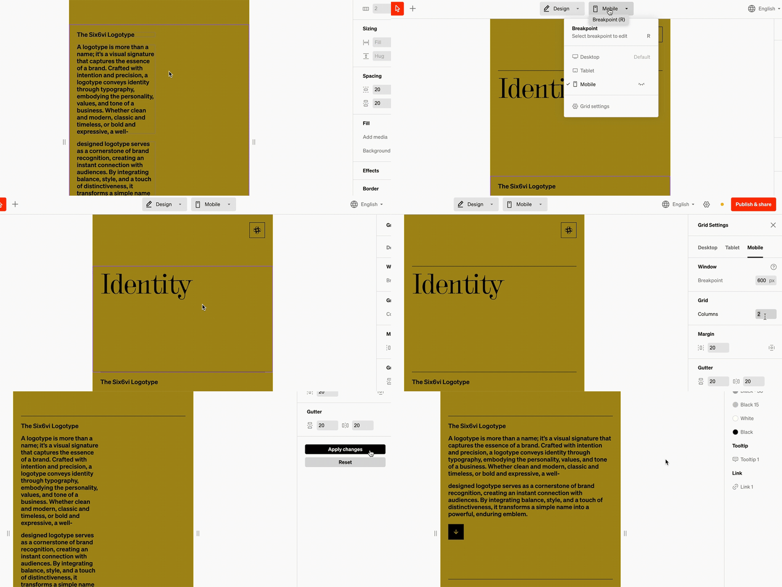
Within the editor select the breakpoint dropdown from the top bar in the center
From the bottom of the breakpoint dropdown, select **Grid settings**
In the right sidebar are settings that will affect an entire breakpoint. Make modifications and save by selecting **Apply changes**.
***
## Grid settings
Grid settings control default spacing, margin, grid count, and breakpoints. They are accessed in the **breakpoint** dropdown from the top bar.
***
## Basics
In Standards the grid setting is modified within each **layout** layer. This is set to a default count and can be overridden on each **layout** at each breakpoint. The grid count sets how many columns can fit within before wrapping.
* **Columns** and the content within fit within the grid of the **layout**
* Each breakpoint has a default grid setting that all **layouts** are set to
* Each **layout’s** default grid count can be set to whatever you like
* If the quantity or width of **columns** within a **layout** exceed the grid count they will wrap below.
### How to change default grid settings
Within the editor select the breakpoint dropdown from the top bar in the center
From the bottom of the breakpoint dropdown, select **Grid settings**
In the right sidebar are settings that will affect an entire breakpoint. Make modifications and save by selecting **Apply changes**.
***
## Grid settings
Grid settings control default spacing, margin, grid count, and breakpoints. They are accessed in the **breakpoint** dropdown from the top bar.
 ### Limit grid width
Essentially a content ‘max width’ can be enabled, so at the desired width the site will stop scaling. Use the alignment to control where the site aligns when the window is above the max width.
### **Grid**
Each breakpoint’s layouts will use the number of columns by default when added. The most common desktop grid is 12 columns, while mobile is most often 1 **column**.
### Margin
The outside spacing default for all **layouts**
### Gutter
The in-between spacing default amount between **columns** both horizontally and vertically when they wrap.
### Breakpoint
Under tablet and mobile, the breakpoint amount is the window width at which the breakpoint is triggered. For instance, a tablet breakpoint of 1020 pixels means if the viewer’s window is at or under 1020 pixels wide the tablet breakpoint settings will display automatically.
***
## Overrides
While there are default grid counts, they can be overridden on any **layout** at any breakpoint. This is most common when designing tile-based layouts like a grid of swatches.
### Limit grid width
Essentially a content ‘max width’ can be enabled, so at the desired width the site will stop scaling. Use the alignment to control where the site aligns when the window is above the max width.
### **Grid**
Each breakpoint’s layouts will use the number of columns by default when added. The most common desktop grid is 12 columns, while mobile is most often 1 **column**.
### Margin
The outside spacing default for all **layouts**
### Gutter
The in-between spacing default amount between **columns** both horizontally and vertically when they wrap.
### Breakpoint
Under tablet and mobile, the breakpoint amount is the window width at which the breakpoint is triggered. For instance, a tablet breakpoint of 1020 pixels means if the viewer’s window is at or under 1020 pixels wide the tablet breakpoint settings will display automatically.
***
## Overrides
While there are default grid counts, they can be overridden on any **layout** at any breakpoint. This is most common when designing tile-based layouts like a grid of swatches.
 ### How to override grids
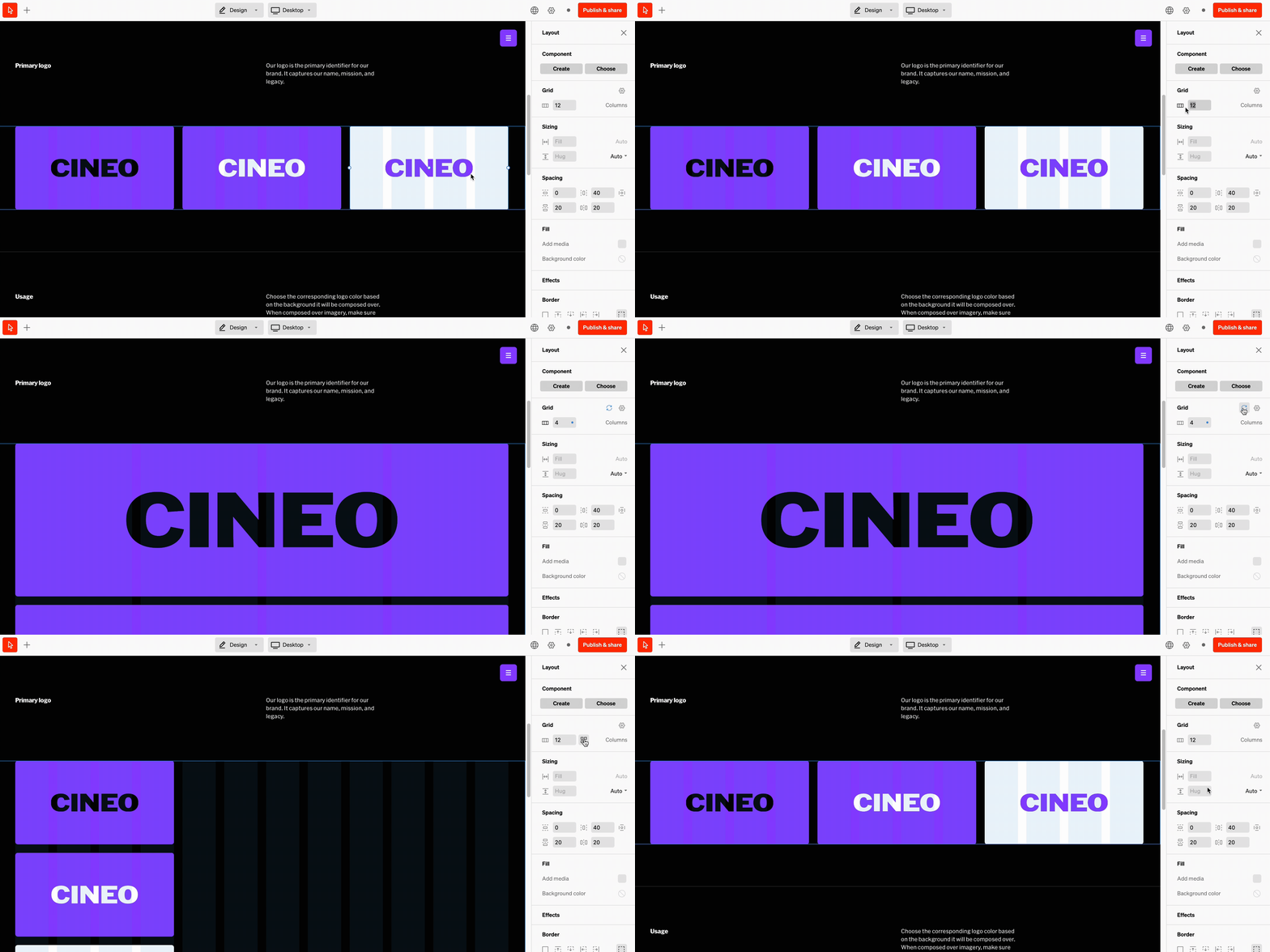
From in body or the contents list, select the layout layer
In the right sidebar, look for the **grid** settings group. Input a new grid count and select the check icon or press return
Each breakpoint can have a unique grid globally, and layout grids overriden in the same way as above. It's a common workflow to check each breakpoint and update their grid as you make overrides.
### How to override grids
From in body or the contents list, select the layout layer
In the right sidebar, look for the **grid** settings group. Input a new grid count and select the check icon or press return
Each breakpoint can have a unique grid globally, and layout grids overriden in the same way as above. It's a common workflow to check each breakpoint and update their grid as you make overrides.