> ## Documentation Index
> Fetch the complete documentation index at: https://help.standards.site/llms.txt
> Use this file to discover all available pages before exploring further.
# Editor Overview
The Editor is a primary area of Standards that offers a comprehensive set of tools for design and publishing.
***
## Overview
Collaborate in real time, set navigation for your project, add content and design to pages, create and manage re-usable Components, browse and upload Files, and share with a wider audience. If you're new to Standards, it may take some time to orient yourself when you first open the project editor. This guide will help you learn where to find different information within the editor so that you’re up to speed and ready to dive in.
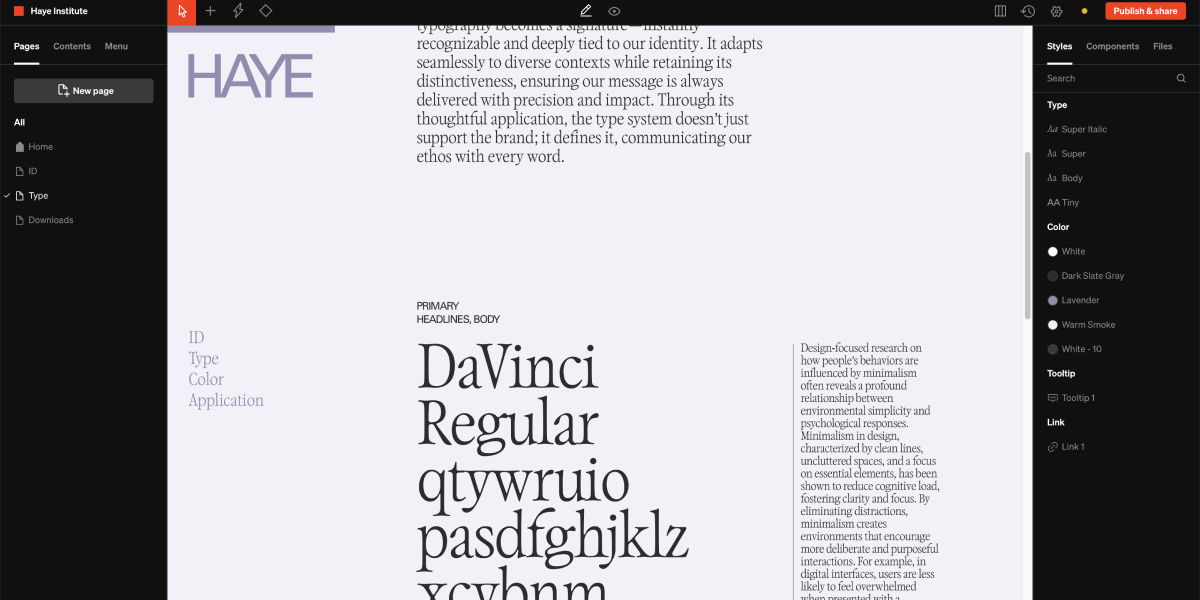 ### Left sidebar
Manage the high-level structure of your project.
* **Pages** - Individual web pages with their own content and URL
* **Content** - Every content layer on the selected page
* **Menu**- Global menu content layers, flexible and defined by the user
### Top toolbar
Add content, manage visibility preferences, track changes, and publish your project.
* **Add**- For adding content to the page body
* **Mode**- Change between design, comment, and content modes
* **Breakpoint** - Add and change between desktop, tablet, and mobile modes
* **Preview** - Toggle a preview mode to preview work similar to if it were published and you were a viewer
* **Language** - Select and add languages
* **Settings (gear icon)** - Show project settings sidebar
* **Status** - Review the publishing status of the project
* **Publish & share (button)** - Show publish and share window to set the web address, access restrictions, share details, and share link appearance like favicon and share image.
### Right sidebar
* **Styles** - Review, edit, and add type, color, tooltip, and link styles
* **Components** - Review and edit existing components
* **Files** - Browse, add, replace, and remove project files
* **Settings** - Contextual to what is selected
### Page body
Add content, preview your design, edit text and set interactivity.
* **Content** - Add text, media, and more to this area to be displayed on the live site
* **In-body toolbar** - Contextual tools to what is selected, enabling options for behaviors like click to download or text styling like underline or color fill.
* **In-body move controls** - Contextual handles to what is selected, move, reorder, and resize content by click + moving these controls around on the grid.
***
## Pages
Pages in Standards are essentially the same as pages on any website, and should feel familiar to anyone who has basic experience designing digital experiences. Each page has a unique URL, and contains a grid layout for content made to scroll vertically inside a web browser.
### Home page
This is the first page a viewer sees when they visit the project on its published domain. Each project must have at least one page, which naturally doubles as the home page. Multi-page projects must specify which page is the Home page. The home page is indicated by a house icon, and can be changed by selecting the three dot icon while hovering on a page in the left bar and selecting **Set as home** from the list of options.
### Layout and grid
### Left sidebar
Manage the high-level structure of your project.
* **Pages** - Individual web pages with their own content and URL
* **Content** - Every content layer on the selected page
* **Menu**- Global menu content layers, flexible and defined by the user
### Top toolbar
Add content, manage visibility preferences, track changes, and publish your project.
* **Add**- For adding content to the page body
* **Mode**- Change between design, comment, and content modes
* **Breakpoint** - Add and change between desktop, tablet, and mobile modes
* **Preview** - Toggle a preview mode to preview work similar to if it were published and you were a viewer
* **Language** - Select and add languages
* **Settings (gear icon)** - Show project settings sidebar
* **Status** - Review the publishing status of the project
* **Publish & share (button)** - Show publish and share window to set the web address, access restrictions, share details, and share link appearance like favicon and share image.
### Right sidebar
* **Styles** - Review, edit, and add type, color, tooltip, and link styles
* **Components** - Review and edit existing components
* **Files** - Browse, add, replace, and remove project files
* **Settings** - Contextual to what is selected
### Page body
Add content, preview your design, edit text and set interactivity.
* **Content** - Add text, media, and more to this area to be displayed on the live site
* **In-body toolbar** - Contextual tools to what is selected, enabling options for behaviors like click to download or text styling like underline or color fill.
* **In-body move controls** - Contextual handles to what is selected, move, reorder, and resize content by click + moving these controls around on the grid.
***
## Pages
Pages in Standards are essentially the same as pages on any website, and should feel familiar to anyone who has basic experience designing digital experiences. Each page has a unique URL, and contains a grid layout for content made to scroll vertically inside a web browser.
### Home page
This is the first page a viewer sees when they visit the project on its published domain. Each project must have at least one page, which naturally doubles as the home page. Multi-page projects must specify which page is the Home page. The home page is indicated by a house icon, and can be changed by selecting the three dot icon while hovering on a page in the left bar and selecting **Set as home** from the list of options.
### Layout and grid
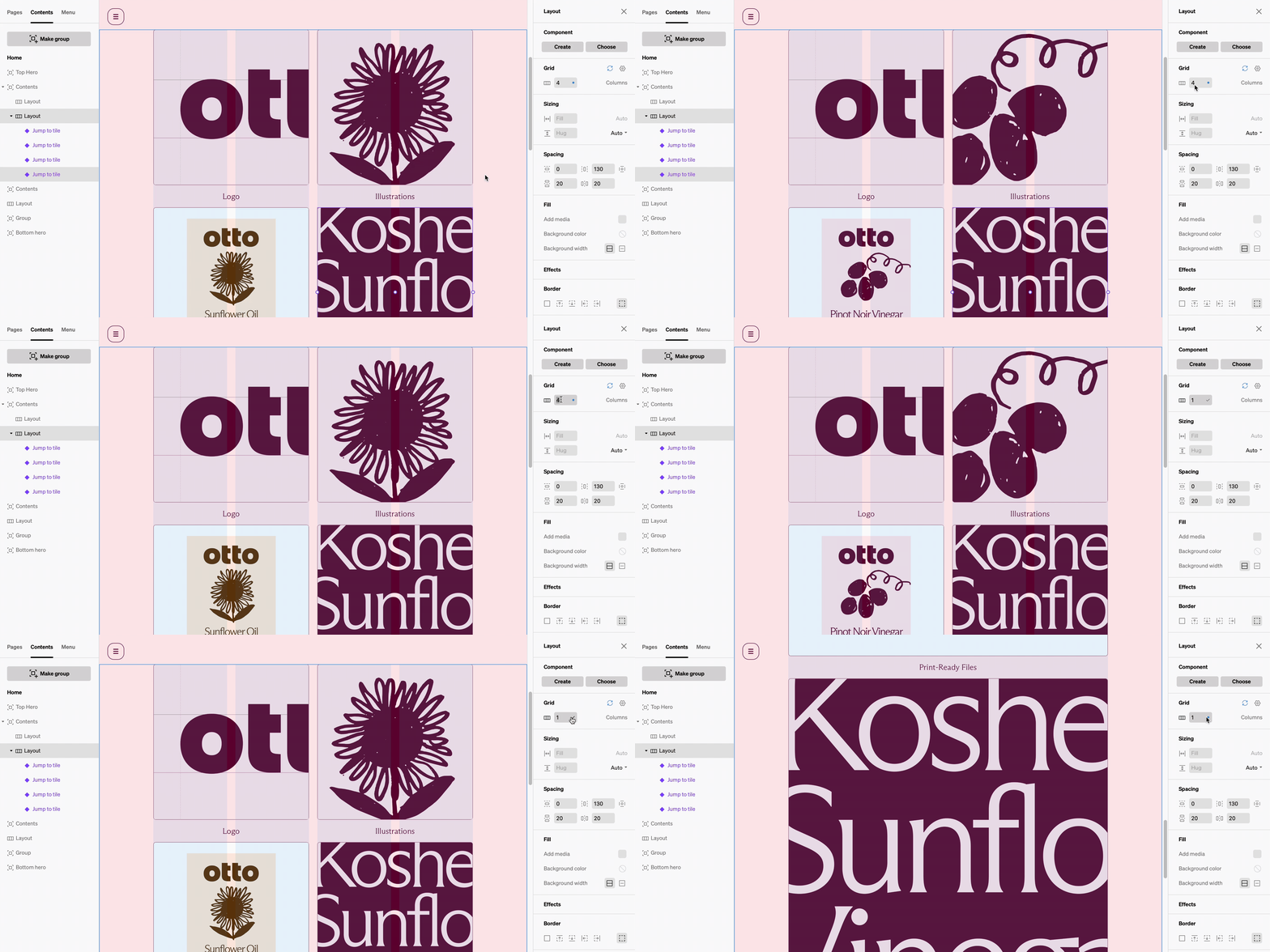 Every page in standards starts with a 12 column responsive grid on Desktop + Tablet, and 1 column on Mobile. All content is added to the grid within two (2) additional organizational containers named **Layout** and **Column**. **Layouts** span across the width of the browser window and have a customizable grid. **Columns** span the grid within **layouts** and group content vertically
### Page Settings
Each page has its own settings panel, which can be accessed by selecting the gear icon while hovering on a page in the left bar. Here you can customize the page URL, as well as the default background and text color.
Learn more about [Pages](/pages)
***
## Content
Anytime content is added to a project, it will appear under **Contents** as a layer. Control what content appears on your page from here. Below is a list of all content types available in Standards.
Every page in standards starts with a 12 column responsive grid on Desktop + Tablet, and 1 column on Mobile. All content is added to the grid within two (2) additional organizational containers named **Layout** and **Column**. **Layouts** span across the width of the browser window and have a customizable grid. **Columns** span the grid within **layouts** and group content vertically
### Page Settings
Each page has its own settings panel, which can be accessed by selecting the gear icon while hovering on a page in the left bar. Here you can customize the page URL, as well as the default background and text color.
Learn more about [Pages](/pages)
***
## Content
Anytime content is added to a project, it will appear under **Contents** as a layer. Control what content appears on your page from here. Below is a list of all content types available in Standards.
 ### Adding content
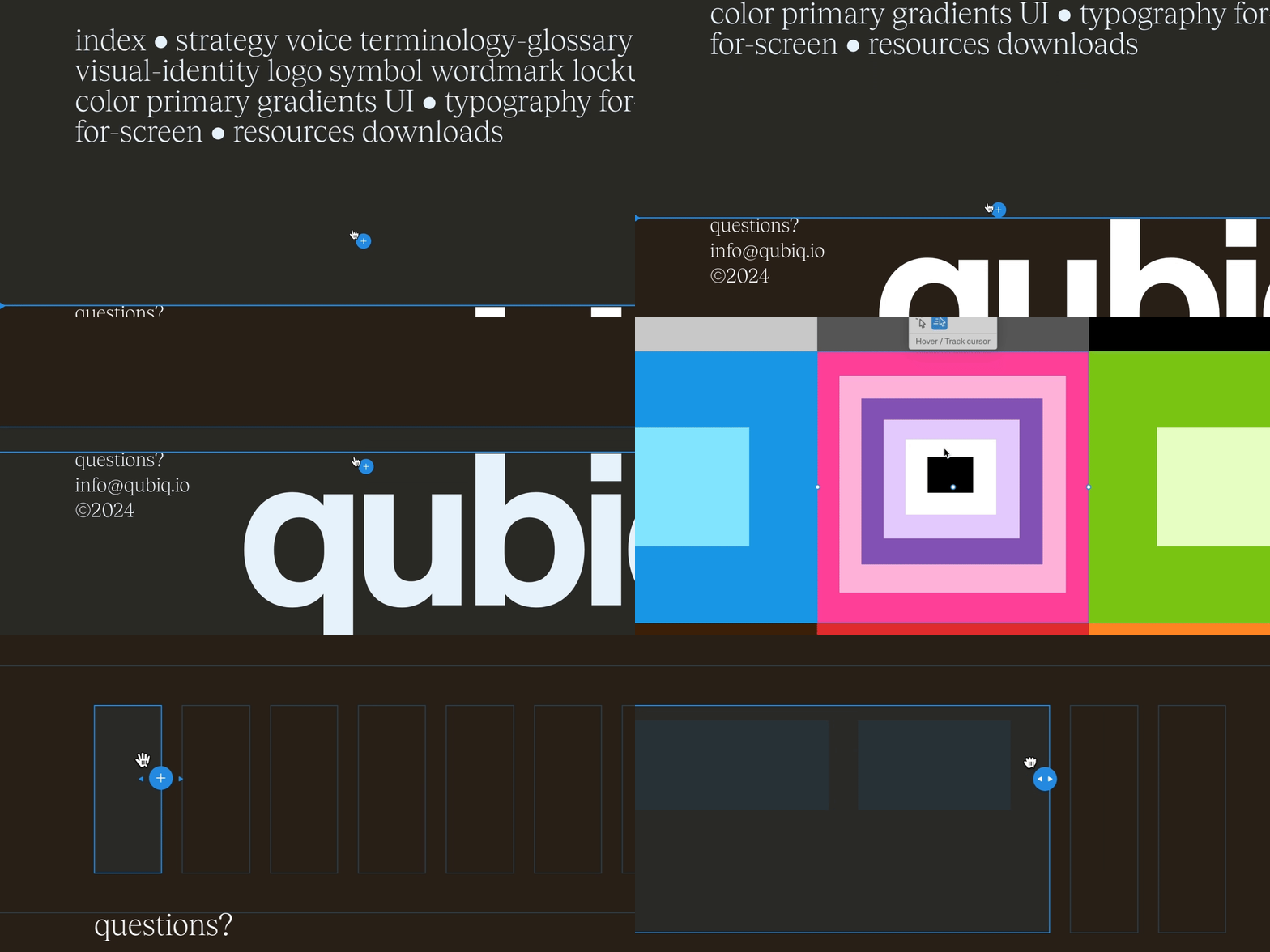
At the top left of the Toolbar, there is one add icon, which opens to show all available content options.
Depending on the option chosen, there will either be a popup to choose options, or the body of the page will highlight with available points to add the chosen content to
Many types of content are added directly to the page by clicking then dragging on the grid. This enables the placement and size you would like.
Once added, select the content to show settings in the right bar that can be edited to reflect your desired design intent.
### Basic content
Hotkey: M \
Displays image and video files: PNG, JPG, GIF, SVG
Hotkey: T \
Displays live text
Hotkey: B\
An interactive element with states like hover, usually used for navigation menu items and downloads, but can be styled as larger cards.
Hotkey: D\
An interactive element that shows and hides nested content
Plays audio files: MP3
Video file player with controls.
Contains slides in sequence navigated with controls, commonly used for slide shows and carousels.
Contains two slides that switch between one another.
### Layout content
Hotkey: S\
An inert layer with a height property.
A structural layer essentially the same as a Layout but can be added inside a column.
### Brand content
Automatically displays common incorrect usage such as stretching a logo, with a violator overlaid.
A scaling sequence of media, commonly used for showing the largest and smallest extent of a logo.
Displays a color, the color's specs, and enables the copy HEX behavior.
A sequence of colors commonly used to show the balance of color usage throughout the brand.
A stack of overlapping colors, commonly used to show pairings.
Displays letters, numbers, characters, and extras of a chosen font.
Displays individual characters from a chosen font.
An input field enabling viwers to test a set type style.
### Embed content
Displays embedded Vimeo video player.
Displays embedded YouTube video player.
Displays embedded Figma file page or prototype.
Diplays embedded Soundcloud audio player.
Displays embedded Spotify audio player.
Displays anything that can be embedded with iframe HTML, a common use is to display Lottie animations.
### Automations
Modular templates of typical sections within brand guideline documents. Learn more about [Automations](/automations).
### Components
Saved designs which can be used repeatedly throughout a project. They can be updated at any time from a single main version, and any changes will sync across all instances. Learn more about [Components](/components).
***
## Menu
### Adding content
At the top left of the Toolbar, there is one add icon, which opens to show all available content options.
Depending on the option chosen, there will either be a popup to choose options, or the body of the page will highlight with available points to add the chosen content to
Many types of content are added directly to the page by clicking then dragging on the grid. This enables the placement and size you would like.
Once added, select the content to show settings in the right bar that can be edited to reflect your desired design intent.
### Basic content
Hotkey: M \
Displays image and video files: PNG, JPG, GIF, SVG
Hotkey: T \
Displays live text
Hotkey: B\
An interactive element with states like hover, usually used for navigation menu items and downloads, but can be styled as larger cards.
Hotkey: D\
An interactive element that shows and hides nested content
Plays audio files: MP3
Video file player with controls.
Contains slides in sequence navigated with controls, commonly used for slide shows and carousels.
Contains two slides that switch between one another.
### Layout content
Hotkey: S\
An inert layer with a height property.
A structural layer essentially the same as a Layout but can be added inside a column.
### Brand content
Automatically displays common incorrect usage such as stretching a logo, with a violator overlaid.
A scaling sequence of media, commonly used for showing the largest and smallest extent of a logo.
Displays a color, the color's specs, and enables the copy HEX behavior.
A sequence of colors commonly used to show the balance of color usage throughout the brand.
A stack of overlapping colors, commonly used to show pairings.
Displays letters, numbers, characters, and extras of a chosen font.
Displays individual characters from a chosen font.
An input field enabling viwers to test a set type style.
### Embed content
Displays embedded Vimeo video player.
Displays embedded YouTube video player.
Displays embedded Figma file page or prototype.
Diplays embedded Soundcloud audio player.
Displays embedded Spotify audio player.
Displays anything that can be embedded with iframe HTML, a common use is to display Lottie animations.
### Automations
Modular templates of typical sections within brand guideline documents. Learn more about [Automations](/automations).
### Components
Saved designs which can be used repeatedly throughout a project. They can be updated at any time from a single main version, and any changes will sync across all instances. Learn more about [Components](/components).
***
## Menu
 Standards offers navigation functionality by allowing each project to include a **Menu**. The menu is an element that exists outside of Page Contents and does not conform to the page grid. Any element can be added to a **Menu**, but it is designed to organize links to pages primarily using **Buttons** and **Dropdowns.**
***
## Styles
The right sidebar in the project **Editor** contains a tab labeled **Styles**. This tab contains categories for **Type**, **Color**, **Tooltip**, and **Link**. These four (4) categories comprise all **Styles** used in Standards. Similar to other design programs, **Styles** are not considered content, but rather a collection of pre-defined settings that affect the appearance of content.
**Styles** are applied to content elements throughout a page for visual consistency, and may be updated in one place from the tab in the right sidebar.
### Managing styles
To add a new style, select the `+` icon next to the header for each category. Name and edit the settings for your newly added style, and select `Done` to finish adding. To edit, duplicate, rename or delete a style, select the three vertical dots while hovering over the side in the right sidebar.
***
## Project settings (gear icon)
### Guides
Modify the appearance of the overlay grid and selection outlines. Toggle guides on and off with hotkey G
### Appearance
These are the defaults of the project, setting all page backgrounds, text color, and text aliasing in the project.
### Accessibility
Enable UserWay plugin. Learn more about [Accessibility](/accessibility).
Standards offers navigation functionality by allowing each project to include a **Menu**. The menu is an element that exists outside of Page Contents and does not conform to the page grid. Any element can be added to a **Menu**, but it is designed to organize links to pages primarily using **Buttons** and **Dropdowns.**
***
## Styles
The right sidebar in the project **Editor** contains a tab labeled **Styles**. This tab contains categories for **Type**, **Color**, **Tooltip**, and **Link**. These four (4) categories comprise all **Styles** used in Standards. Similar to other design programs, **Styles** are not considered content, but rather a collection of pre-defined settings that affect the appearance of content.
**Styles** are applied to content elements throughout a page for visual consistency, and may be updated in one place from the tab in the right sidebar.
### Managing styles
To add a new style, select the `+` icon next to the header for each category. Name and edit the settings for your newly added style, and select `Done` to finish adding. To edit, duplicate, rename or delete a style, select the three vertical dots while hovering over the side in the right sidebar.
***
## Project settings (gear icon)
### Guides
Modify the appearance of the overlay grid and selection outlines. Toggle guides on and off with hotkey G
### Appearance
These are the defaults of the project, setting all page backgrounds, text color, and text aliasing in the project.
### Accessibility
Enable UserWay plugin. Learn more about [Accessibility](/accessibility).