> ## Documentation Index
> Fetch the complete documentation index at: https://help.standards.site/llms.txt
> Use this file to discover all available pages before exploring further.
# Dropdown
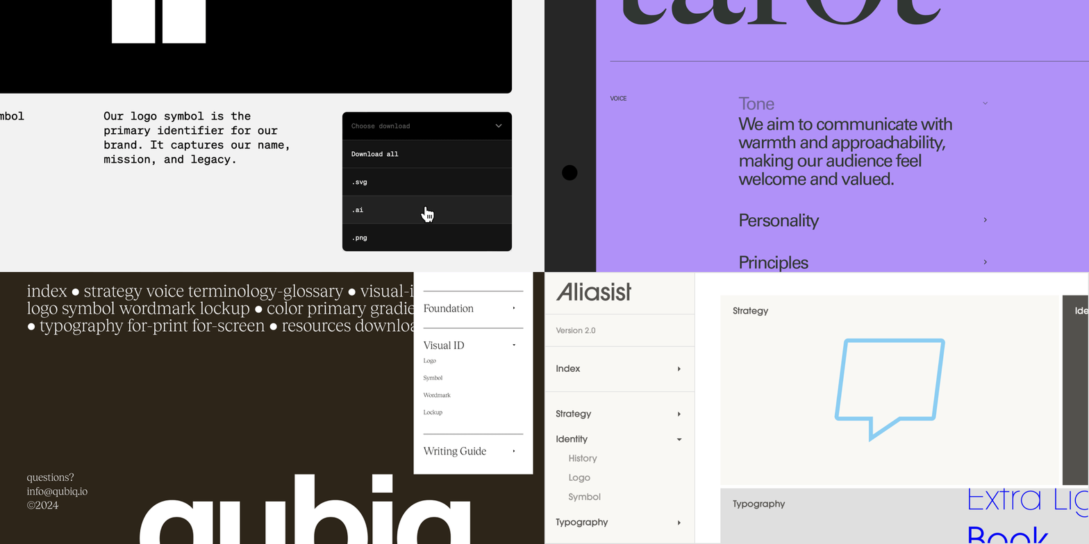
Dropdowns are flexible elements used to organize other elements. They are similar to Buttons in that they can be styled in many ways, but additionally they can show and hide their contents.
 ***
## Dropdown basics
**Dropdowns** are an element that can be added to your project layout and menu, and consists of four + parts: the **dropdown** container, the **controls** container, **text** content in controls, and the **icon** content in controls. Additional elements can be added into Dropdowns, such at **Text** and **Media**.
### Adding dropdowns
***
## Dropdown basics
**Dropdowns** are an element that can be added to your project layout and menu, and consists of four + parts: the **dropdown** container, the **controls** container, **text** content in controls, and the **icon** content in controls. Additional elements can be added into Dropdowns, such at **Text** and **Media**.
### Adding dropdowns
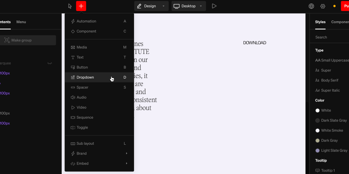 From within the editor, select **Dropdown** from the `+` menu in the top bar, or use the hotkey D
Select a point in the project body by selecting between layouts, click + dragging within, or selecting a point inside a column.
To nest content inside a dropdown, select the dropdown first, then use the `+` menu to add content the same way you would anywhere else.
### Dropdown states
**Dropdowns** have a range of states that can be styled individually, or synced together. Both closed and open have rest and hover states.
* **Closed:** All content other than **controls** are hidden.
* **Open:** All content is exposed.
### Settings within dropdown states
Each state can have fill and stroke settings altered independently from another, or synced together.
***
## Controls
**Controls** are an essential part of **dropdowns** with their own settings. **Controls** share many similarities with **buttons**, but are special because they trigger open & close behaviors on the **dropdown.**
### Controls settings
While selecting the **controls** part of a **dropdown**, the right sidebar will display the available settings for styling them.
### Controls states
**Controls** have a range of states that can be styled individually, or synced together. Both open and closed have rest and hover states.
* **Closed:** When the **dropdown** is closed.
* **Open:** When the **dropdown** is open.
***
## Dropdown behavior settings
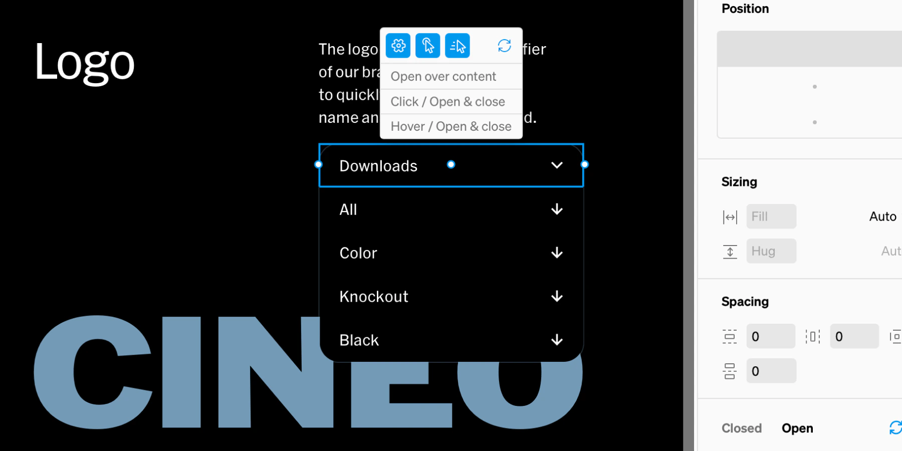
Dropdowns can be used for a wide range of applications, and much of their core behavior is controlled within the settings accessed from the in-body toolbar.
From within the editor, select **Dropdown** from the `+` menu in the top bar, or use the hotkey D
Select a point in the project body by selecting between layouts, click + dragging within, or selecting a point inside a column.
To nest content inside a dropdown, select the dropdown first, then use the `+` menu to add content the same way you would anywhere else.
### Dropdown states
**Dropdowns** have a range of states that can be styled individually, or synced together. Both closed and open have rest and hover states.
* **Closed:** All content other than **controls** are hidden.
* **Open:** All content is exposed.
### Settings within dropdown states
Each state can have fill and stroke settings altered independently from another, or synced together.
***
## Controls
**Controls** are an essential part of **dropdowns** with their own settings. **Controls** share many similarities with **buttons**, but are special because they trigger open & close behaviors on the **dropdown.**
### Controls settings
While selecting the **controls** part of a **dropdown**, the right sidebar will display the available settings for styling them.
### Controls states
**Controls** have a range of states that can be styled individually, or synced together. Both open and closed have rest and hover states.
* **Closed:** When the **dropdown** is closed.
* **Open:** When the **dropdown** is open.
***
## Dropdown behavior settings
Dropdowns can be used for a wide range of applications, and much of their core behavior is controlled within the settings accessed from the in-body toolbar.
 ### Open on pages
When on, the dropdown will stay open if an item within is linked to a page that the viewer is currently viewing. This is great for navigations where the page and page sections are linked.
### Active on pages
Similar to open on pages, enabling active on pages will show the active state of the dropdown if an item within is linked to a page that the viewer is currently viewing.
### Always open
The state of the dropdown will stay in open.
### Open over content
When opened, the dropdown will show over content below it. This is ideal when using dropdowns in-body. When turned off, dropdowns will push content down when open, often preferred in navigation menus.
***
## Examples
**Dropdowns** have a wide range of use. Here are common uses:
### Open on pages
When on, the dropdown will stay open if an item within is linked to a page that the viewer is currently viewing. This is great for navigations where the page and page sections are linked.
### Active on pages
Similar to open on pages, enabling active on pages will show the active state of the dropdown if an item within is linked to a page that the viewer is currently viewing.
### Always open
The state of the dropdown will stay in open.
### Open over content
When opened, the dropdown will show over content below it. This is ideal when using dropdowns in-body. When turned off, dropdowns will push content down when open, often preferred in navigation menus.
***
## Examples
**Dropdowns** have a wide range of use. Here are common uses:
 ### Menu groups
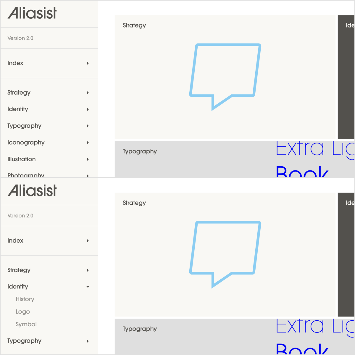
Building menus with **dropdowns** is a great way to create grouping related items together. For example, a **dropdown** could contain links to the sections of a page, or links to multiple pages in a section.
### Menu groups
Building menus with **dropdowns** is a great way to create grouping related items together. For example, a **dropdown** could contain links to the sections of a page, or links to multiple pages in a section.
 ### Accordions
**Dropdowns** can be used throughout the main body of Standards sites, and used to show and hide content within.
### Accordions
**Dropdowns** can be used throughout the main body of Standards sites, and used to show and hide content within.