> ## Documentation Index
> Fetch the complete documentation index at: https://help.standards.site/llms.txt
> Use this file to discover all available pages before exploring further.
# Click & Hover Behaviors
Click and hover behaviors are fundamental settings that transform static pages into a dynamic website.
 ***
## Click
**Click** is a grouping of settings that trigger a behavior from a mouse click and are contextual to the element it’s enabled on. **Click** can be enabled on various elements such as **media** and **button**.
***
## Click
**Click** is a grouping of settings that trigger a behavior from a mouse click and are contextual to the element it’s enabled on. **Click** can be enabled on various elements such as **media** and **button**.
 ### Common uses
* Hyperlinking **Text** for navigation and external links
* Downloading files from **Media** and **Buttons**
* Copying hex codes from color **Swatches**
* View full list of behaviors below
### Applying click behaviors
Choose the element from the left sidebar contents list or from in body. Note: Not all layers can recieve click behaviors.
After selecting an element, a small contextual toolbar will appear. Select the click button (cursor clicking icon) to open the menu.
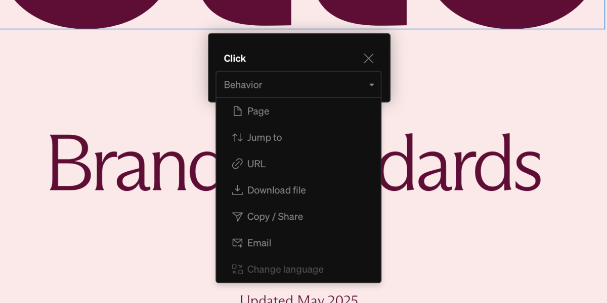
Select the desired behavior from the listed options then fill the additional information suitable for each behavior
**Tip:** Make sure the desired element is selected. It is easy to select groups, rows, columns which do not have **Click** options.
### Click behaviors
Link to other **pages**. Specific sections of pages can be set. Next or previous page can be set to automatically navigate.
Auto-scoll to the top or bottom of a page.
Link to external sites with an option to open in a new tab
Select an uploaded file that can be downloaded by the viewer
Enter text or a URL that can be copied to the viewer’s clipboard to paste elsewhere
Automatically copy an email and open the viewer’s email app.
Automatically copy the HEX color code into your clipboard. This is only available on **Color Swatch** and **Albers’ Proportion.**
Open and close the element. This is only available on **Menu** and **Dropdown**.
Progress a **Sequence** forward and backward.
Change to the chosen language.
***
## Hover
**Hover** is a grouping of settings that trigger a behavior from a mouse hovering over and are contextual to the element it’s enabled on. **Hover** can be enabled on various elements such as **media** and **button**.
### Common uses
* Hyperlinking **Text** for navigation and external links
* Downloading files from **Media** and **Buttons**
* Copying hex codes from color **Swatches**
* View full list of behaviors below
### Applying click behaviors
Choose the element from the left sidebar contents list or from in body. Note: Not all layers can recieve click behaviors.
After selecting an element, a small contextual toolbar will appear. Select the click button (cursor clicking icon) to open the menu.
Select the desired behavior from the listed options then fill the additional information suitable for each behavior
**Tip:** Make sure the desired element is selected. It is easy to select groups, rows, columns which do not have **Click** options.
### Click behaviors
Link to other **pages**. Specific sections of pages can be set. Next or previous page can be set to automatically navigate.
Auto-scoll to the top or bottom of a page.
Link to external sites with an option to open in a new tab
Select an uploaded file that can be downloaded by the viewer
Enter text or a URL that can be copied to the viewer’s clipboard to paste elsewhere
Automatically copy an email and open the viewer’s email app.
Automatically copy the HEX color code into your clipboard. This is only available on **Color Swatch** and **Albers’ Proportion.**
Open and close the element. This is only available on **Menu** and **Dropdown**.
Progress a **Sequence** forward and backward.
Change to the chosen language.
***
## Hover
**Hover** is a grouping of settings that trigger a behavior from a mouse hovering over and are contextual to the element it’s enabled on. **Hover** can be enabled on various elements such as **media** and **button**.
 ### Common uses
* Showing **Tooltips**
* Swapping between two **Media** files
* Playing video **Media**
### Applying hover behaviors
Choose the element from the left sidebar contents list or from in body. Note: Not all layers can recieve hover behaviors.
After selecting an element, a small contextual toolbar will appear. Select the hover button (cursor hovering icon) to open the menu.
Select the desired behavior from the listed options then fill the additional information suitable for each behavior
**Tip:** Make sure the desired element is selected. It is easy to select groups, layouts, columns which do not have **On click** options
### Hover behaviors
Display a **Tooltip** over the hovered element. Tip: manage tooltip appearance from the styles tab of the right sidebar.
Change back and forth between two **Media** files
Play and pause video **Media**
Play and pause audio in video **Media**
Colors follow cursor inside of **Albers’ Proportion**
### Common uses
* Showing **Tooltips**
* Swapping between two **Media** files
* Playing video **Media**
### Applying hover behaviors
Choose the element from the left sidebar contents list or from in body. Note: Not all layers can recieve hover behaviors.
After selecting an element, a small contextual toolbar will appear. Select the hover button (cursor hovering icon) to open the menu.
Select the desired behavior from the listed options then fill the additional information suitable for each behavior
**Tip:** Make sure the desired element is selected. It is easy to select groups, layouts, columns which do not have **On click** options
### Hover behaviors
Display a **Tooltip** over the hovered element. Tip: manage tooltip appearance from the styles tab of the right sidebar.
Change back and forth between two **Media** files
Play and pause video **Media**
Play and pause audio in video **Media**
Colors follow cursor inside of **Albers’ Proportion**