> ## Documentation Index
> Fetch the complete documentation index at: https://help.standards.site/llms.txt
> Use this file to discover all available pages before exploring further.
# Button
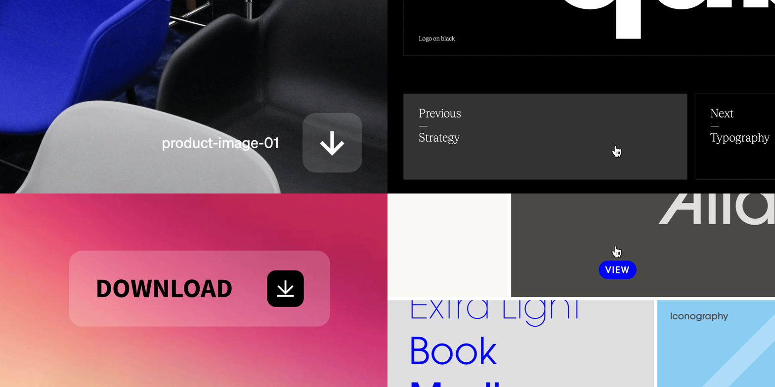
Buttons are flexible elements with visual impact that are used in various ways such as linking to file downloads and hyperlinking between pages.
 ***
## Button basics
**Buttons** are an element that can be added to your project layout and menu, and consists of three parts: the button container, the text content, and the icon content. **Buttons** may have **Text**, **Icon,** or both shown or hidden.
### Button variations
***
## Button basics
**Buttons** are an element that can be added to your project layout and menu, and consists of three parts: the button container, the text content, and the icon content. **Buttons** may have **Text**, **Icon,** or both shown or hidden.
### Button variations

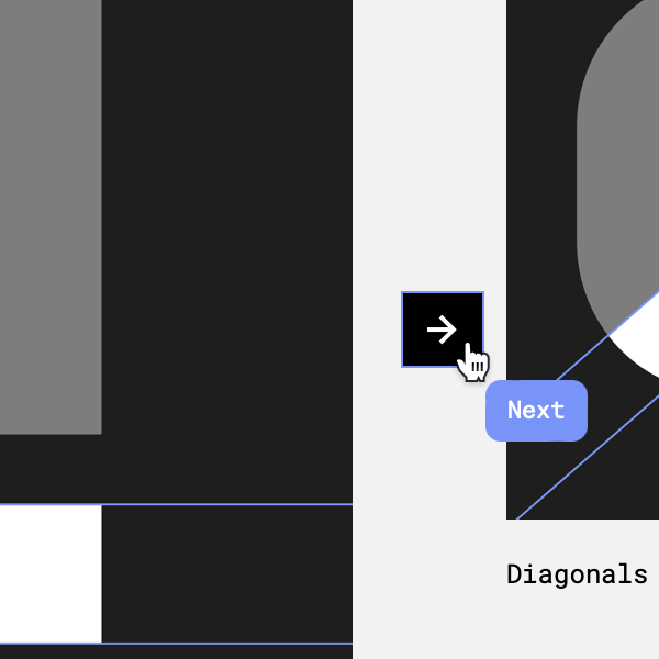
 **Button** with text & icon content turned on.
**Button** with just icon content turned on.
**Button** with just text content turned on.
### Adding buttons
**Button** with text & icon content turned on.
**Button** with just icon content turned on.
**Button** with just text content turned on.
### Adding buttons
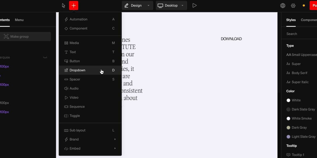 From within the editor, select **Button** from the `+` menu in the top bar, or use the hotkey B
Select a point in the project body by selecting between layouts, click + dragging within, or selecting a point inside a column.
Select the click behavior button from the contextual toolbar and choose the desired behavior, like download file or link to page.
***
## General use
**Buttons** have a wide range of use. Here are common general uses:
### Linking
Setting **On click** → **Link to** is a common use for making buttons into navigating elements in body and in menus.
### Menu items
Building menus with **buttons** is a great way to create navigation items. Doing this allows for a wide range of styling, beyond regular **text**, such as hover and active states.
***
## Advanced
**Buttons** can be used in creative ways to enhance a site’s navigation with larger visual impact.
### Table of contents
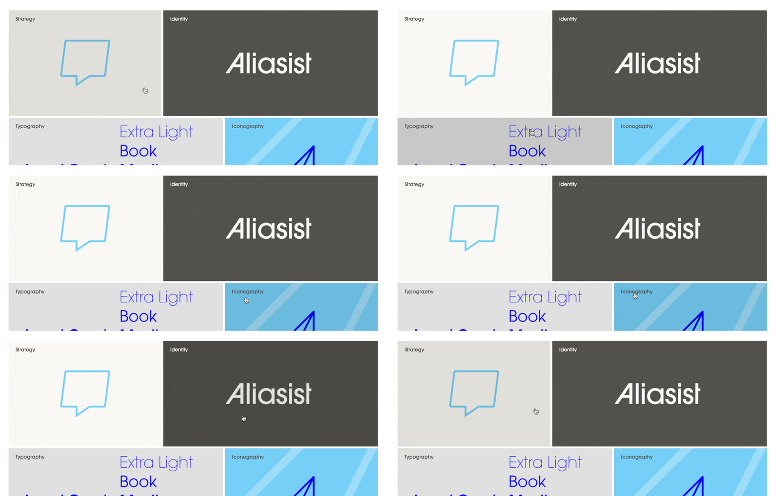
A grid of buttons can be used to create a tiled grid linking to different sections of a site.
From within the editor, select **Button** from the `+` menu in the top bar, or use the hotkey B
Select a point in the project body by selecting between layouts, click + dragging within, or selecting a point inside a column.
Select the click behavior button from the contextual toolbar and choose the desired behavior, like download file or link to page.
***
## General use
**Buttons** have a wide range of use. Here are common general uses:
### Linking
Setting **On click** → **Link to** is a common use for making buttons into navigating elements in body and in menus.
### Menu items
Building menus with **buttons** is a great way to create navigation items. Doing this allows for a wide range of styling, beyond regular **text**, such as hover and active states.
***
## Advanced
**Buttons** can be used in creative ways to enhance a site’s navigation with larger visual impact.
### Table of contents
A grid of buttons can be used to create a tiled grid linking to different sections of a site.
 ### Pagination
Two side by side half width buttons can be used at the bottom of pages to link between pages
### Pagination
Two side by side half width buttons can be used at the bottom of pages to link between pages
 ***
## Button settings
While selecting a **Button** element, the right sidebar will display the available settings for styling the container as well as the text and icon within. Each state can have these settings altered independently from another, or synced together.
***
## Button states
All buttons have various states that can be styled. This allows for visual hierarchy between default and active or rest and hover.
### Default
Button is off/unselected
* **Rest:** cursor elsewhere
* **Hover:** cursor over the button
### Active
Button is on/selected
* **Rest:** cursor elsewhere
* **Hover:** cursor over the button
***
## Tip: Button components
Buttons are one of the best candidates for making into components. Style a button, create a component of it, then use it throught your guideline.
***
## Button settings
While selecting a **Button** element, the right sidebar will display the available settings for styling the container as well as the text and icon within. Each state can have these settings altered independently from another, or synced together.
***
## Button states
All buttons have various states that can be styled. This allows for visual hierarchy between default and active or rest and hover.
### Default
Button is off/unselected
* **Rest:** cursor elsewhere
* **Hover:** cursor over the button
### Active
Button is on/selected
* **Rest:** cursor elsewhere
* **Hover:** cursor over the button
***
## Tip: Button components
Buttons are one of the best candidates for making into components. Style a button, create a component of it, then use it throught your guideline.